Data visualisation for custom activity fields
The Limes Community and Children's Centre
The client has to provide evaluations on children on 4 scales. The evaluations are qualitative written reports and quantitative points on a 1 to 10 scale.
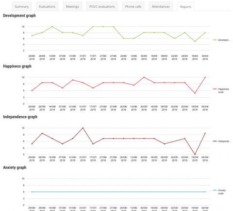
The client found it difficult to visualise progress on these scales.
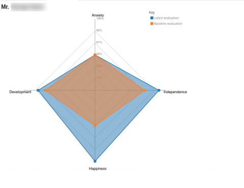
Instead of line charts we took the first evaluation as a baseline and superimposed the latest evaluation on a radar chart using d3.js.
Background
The Centre runs projects for children and young adults with disabilities, mainly funded by grant. Grant providers need to see that their grant funding is being applied properly. Part of that is demonstrating the benefit to children during the course of a project.
The Limes also needs to monitor the children's progress to meet it's own organisational objectives
Challenges
Data is recorded in many ways to provide monitoring. Much is through qualitative feedbacl through interviews, observations and so on. The Limes are also adopting quantitative measures of happiness, anxiety, development and independence. These measures are designed to be objective and repeatable. The Limes wanted to be able to visualise progress between the start of a child's journey on a project and where they are to date.
The challenge for the Limes to to maintain a set of objective measures for each point on the scale and to train staff how to use them in an evaluation.
Solution
The Limes use CiviCRM to manage the day to day affairs of the Centre and their membership system, event bookings and so on. They use CiviCRM actvities to record evaluations of children. These activities contain custom fields to measure a child's progress.
Functionality
Originally they had line graphs using Google Charts. See the first screen grab.
We decided to use d3.js and radarchart.js libraries to visualise the data. By superimposing a current evaluation over a baseline evaluation, the Centre can immediately see where progress is being made or not. The radar graph area gives immediate feedback. On the screegrab it is clear that this child improved in general because the Latest evaluation area is larger that the Baseline evaluation area. Looking along one of the 4 axes shows where improvements can be made.
We use Drupal Views to dynamically change the data for each child.
Tony Horrocks, Xpdient
Liz Fraser, The Limes
Abby Widger, The Limes


