Keep your eye on your calendar. Not on your clock. That's how the people—not the generals—the people fighting for their liberation measure time.
- Arundhati Roy in her PEN Pinter Prize Speech
The stories that non-profit fundraisers tell about their work tend to focus on clear-eyed decisions leading to success. We want to be part of such simple stories.
Of course, reality is not so simple. And considering recent history, maybe that's a good thing. It kind of makes me think of a video series my son likes, called "Honest Trailers", you can probably guess what that's about.
The honest trailer version of a fundraising pitch might be something like "Yeah, we're pushing these rocks uphill, mostly they just come back down and run us over, and honestly, we're not sure which ones we should be pushing, and I'm not sure I actually like you, but for sure, come help us."
Yes, I'm not a fundraiser. But I have been around long enough to know that organizations that are going to have longer term financial sustainability really like monthly donors. Those are your supporters that are looking at the calendar.
The Problem
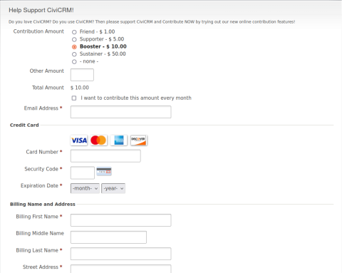
So let's take a look at the donor experience when CiviCRM's recurring contribution feature is enabled on a contribution page. Here's the classic default donation page when installing the demo (courtesy of the dmaster demo, with the recurring option clicked).

As a donor, you're asked to pick an amount, and then you're asked if you want to make that contribution every month, with a default of "off".
That's better than not having recurring contributions, but as my clients have often noticed, it could use a lot of improvement.
Specifically, if you're a fundraiser trying to emphasize the value of the recurring contribution you're going to send your donor to this page and tell them to remember to click the recurring button. In addition, the amount options you want give them as a monthly donor are likely to be different than the amounts for a one-time donation. That's a "pushing the rock uphill" kind of experience.
A Better Experience
Here are some ideas of how we can imagine making a better interface to encourage supporters to be monthly (recurring) donors. None of these are things that CiviCRM can do "out of the box".
1. Configure the page to have recurring as the default.
Pretty simple, an improvement for a non-default contribution page you're going to send your existing one-time donors to as a way to upgrade them to monthly donors. Downside: the risk of alienating or confusing one-time donors.
2. Force the page as recurring.
Sure, let's set up a recurring contribution page specifically for the purpose of the donor upgrade plan. Keep it simple and make it clear that the page is only for recurring donations. That way you can set the amounts for monthly donation amounts and have clear and consistent messaging.
3. Let's have it all.
The most complicated solution is one that:
a. presents the monthly/one-time options more clearly and before the amounts are chosen.
b. allows for different monthly/one-time options.
c. allows the administrator to decide whether one-time or monthly is the default.
There's An Extension For That
Over the years, I've added these ideas into my extension called "CiviContribute Recur Extra". That extension started 10 years ago and has accumulated an impressive (or scary) number of features, including support for the above ideas.
Recently a colleague rewrote the 'switcher' javascript to be more accessible, modern and useable, and it seemed a good idea to incorporate these improvements into the extension. It also felt like a good time to pull them out into their own extension so they're not so lost and confusing in the rest of that extension.
So here's the result: the Recurring Contribution UX extension.
Instructions:
- Install the extension (should be available via the ui soon, but you can just follow the instructions on the extension page for now). It won't do anything by just installing it.
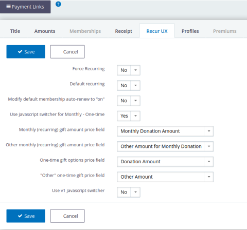
- Visit the contribution page configuration, where you'll see a new tab "Recur UX".

There you can see the simple options (default recurring, and force recurring), as well as the more complicated "Use javascript switcher for Monthly - One-time.
3. To use the switcher, you'll want to first setup a price set that can support what it's doing, i.e. a price set with separate options for one-time vs. monthly. Typically, that involves four price fields, two for each of one-time vs monthly, with a list of radio options for the suggested amounts and an 'Other' text field amount. You don't actually need the "other" option if you just want the suggested amounts.
Here's from my example above:

4. Once you've got the price fields setup, and you've selected that price set for your contribution page, you'll see them show up as options for the 4 configuration options for the recurux tab (already selected in my example above). Name them whatever you want! (yes, if you used the earlier version in the recurring extra, you had to follow some naming conventions).
5. The last option "Use v1 javascript switcher" makes use of the previous javascript that I used in the old recurring extra extension. If v2 (the default) doesn't work well for you, go ahead and try this one, it's a bit more battle-tested.
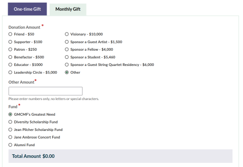
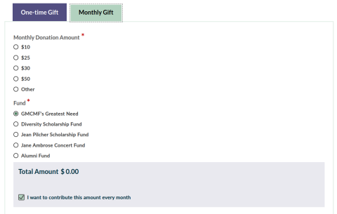
Tada! Here's the result, with thanks to the most recent sponsor of this work the Green Mountain Chamber Music Festival. Also thanks to Fair Vote Canada, who sponsored the first version of the switcher, and Canadians for Tax Fairness, who sponsored the original idea of a separate monthly donation page, and Susanna Celso, who wrote v2 of the javascript.


