Hi, I'm Siddhant Rajagopalan, a second year undergraduate student studying CSE from IIT Bombay.
I am currently working on improving the usability of CiviMail as my GSoC 2014 project. We are at around the midterm stage of the project, this post is to get feedback on the progress made.
My previous blog post which talks about my project can be seen at https://civicrm.org/blogs/rajgo94/mail-blast-ui-mockups-and-plan-coming-weeks.
I greatly appreciate the feedback received for that blog post.
We stuck to a tab UI made using AngularJS based on the feedback received for the mockups. We can switch from one tab to another interactively.
The code is available on my github. If interested do check https://github.com/rajgo94/civicrm-core.
Break-Up of Mailing UI
Mailing List.
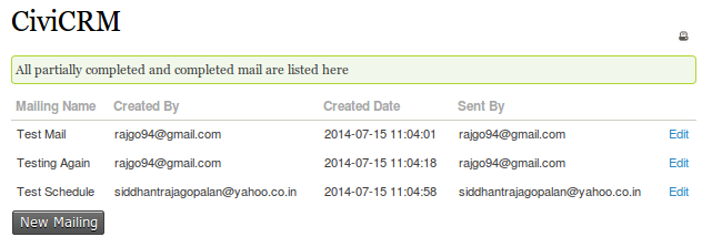
I have made a mailing list page where all the mails are listed along with the sender of the mail and few other details. This gives the option to edit existing mails or create a new one.
Recipient
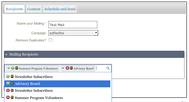
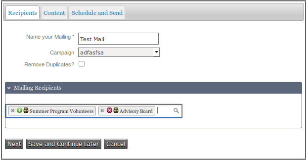
Currently it is a 3 tab UI.
Most of the accordians inside the tabs are collapsed by default.
The recipient tab uses a select2 widget to include and exclude the groups as well as the previous mailings. In one select2 widget that allows multiple selections, we can include and exclude the groups or mailings of our choice.
We can switch between tabs anytime using next and previous or otherwise by simply clicking on the tab. I have added basic validation for various required fields.
Content
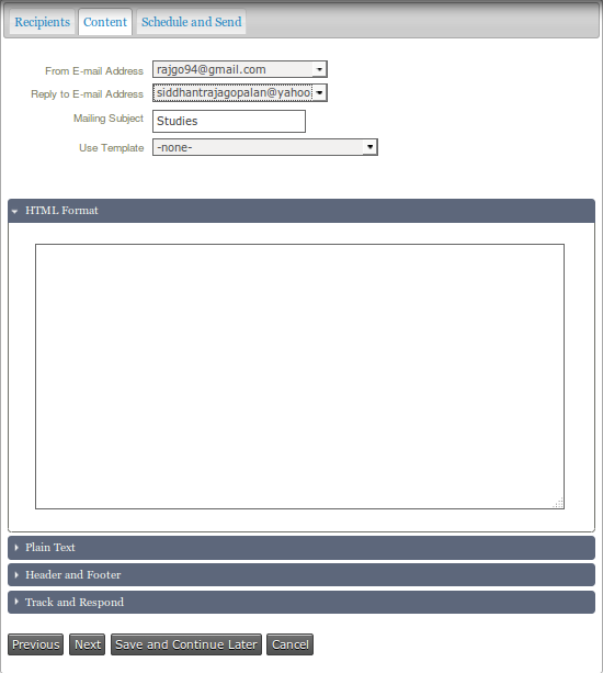
The second tab is Content. It has 3 accordions, all collapsed initially.
Mailing Subject is a required field on this page.
Track and Respond
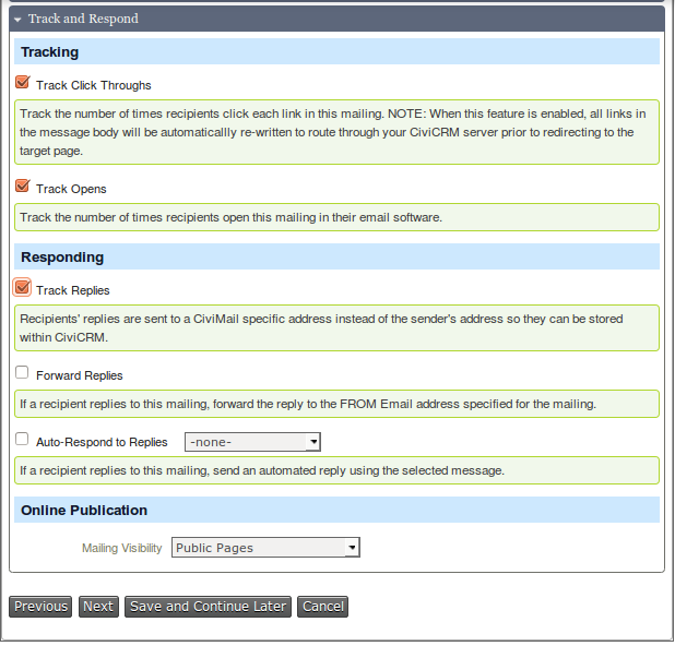
Works in the same way as current CiviMail.
Schedule and Send
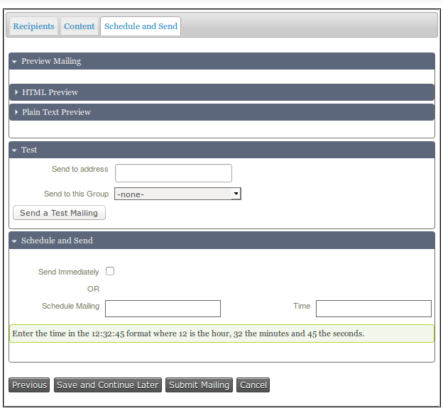
Datepicker has been used to select the date for scheduling the mailing. The time has to be inserted manually.
Next Stages:
- I have completed most of the front-end code as well as saving to the CiviCRM database, so need to fix few issues with update mode.
- Currently I am using a textarea for HTML content, so switch to wysiwyg editor.
- Add tokens support for content
- Fix preview mailing, this might require creating new APIs and also tests
- Fix existing know bugs in the code
Any feedback would be greatly appreciated.


Comments
Interesting that you and I had the same idea about axing the old "advmultiselect" group selector. Are you using select2 for that? (if not you probably should rather than introducing another plugin with the same functionality since we ship select2 with core).
See https://github.com/civicrm/civicrm-core/pull/3673
I'm not sure if you have ever used the SMS feature in CiviCRM but it's an embarrassing fact that all of the mass-SMS code was copy-pasted from the mass-mail code -- it's a maintenance nightmare. If you still have time to work on this (and it sounds like you do since you are at half-time and so far along already) I strongly encourage you to make sure your code is abstract and reusable (this may require some rewrites but will be well worth it!) and then plug the SMS code in to use this new UI, getting rid of all that copy-paste boondoggle.
Reading with interest. Could a time be automatically inserted in field (which could be amended) instead of leaving blank?. Perhaps the current time of filling form being automatically inserted. Looks good regardless.
This looks great, and I really like the interface of selecting groups. (I get irritated by the "advanced" multi-select).
One important thing to test will be what happens when you have a well-used site with a hundred groups and hundreds of past mailings. That's a lot of things to pull, and then to have them show up twice (include and exclude), even a reasonable search will be cumbersome.
Also, the + and X aren't 100% clear unless you have the benefit of knowing that you can both include and exclude folks. One might reasonably think that the X is to remove the group from the box of selected groups.
I wonder if making it two separate select2 fields would actually make it simpler: one for groups and mailings to include, and one for those to exclude.
Going back to the person who's been using CiviCRM for years: it'll be important that there be no limit on the number of suggested matches. Organizations who use CiviCRM for years may have several dozen past mailings named "year-end appeal" with all the combinations of segments, follow-ups, and years:
There's nothing you can do to stop this from being long, but it will just be an important factor to consider: assume that the list of past mailings is repetitive and a mile long.
The new EntityRef widget in 4.5 is the first time that this possible in CiviCRM - using the ajax api it presents the user with an infinitely-scrolling searchable list of choices with extra info (description, date, etc) to make them distinguishable.
These screen prints look so much better than the older mass mail screen layouts. I can't wait to use it.
One screen that I think is confusing for users is the area for "Mailing Recipients"
It is confusing to list groups to exclude in this section . I would add a new section to that screen labeled "Mailing Exclusions" or similar. (which should be collapsed by default as in my experience this is rarely used. ) The existing double icons each with an X is very confusing.
Thanks for all your work so far.
Why is the setting for "Online Publication" nested underneath the section for "Track and Respond"? I think this is confusing as a typical end-user would not understand they need to click/expand "Track and Respond" in order to change the visibility.
Andrew totally agree with the suggestion that "making it two separate select2 fields would actually make it simpler: one for groups and mailings to include, and one for those to exclude."
It may seem 'tidier' to do this in one field, but it surely risks more mistake.
Having one field for INCLUDE and a separate one for EXCLUDE is way more obvious imo.
I also agree with the previous comments to keep the include/exclude options as separate fields. For a reasonably sized org, it would not be uncommon to have a hundred groups and hundreds of mailings. It's hard as it is to search through those -- we don't want to double the length unnecessarily.
A few other comments: