Whenever a new CiviCRM version is released, the announcements tend to focus on new features, which lately have been mostly improvements to SearchKit, FormBuilder and Api4, the underlying tools that will help build new CiviCRM interfaces. While you can already use SearchKit/FormBuilder for custom listings and forms, out of the box, the improvements are not very visible.
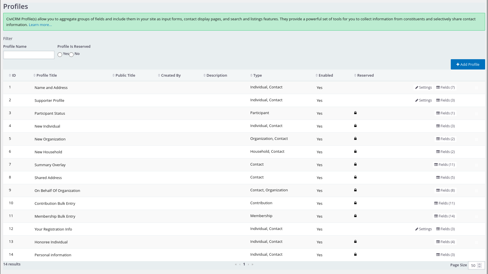
One of the important ongoing initiatives is the Administration UI extension. If you go to Administer > System Settings > Extensions, it is already possible to enable that extension to see new administrative interfaces built on SearchKit (h/t Aidan). Some of the more complex forms such as Manage Event or Manage Contribution Page might take more time, but it supports Custom Fields and Profiles, for example. The newer SearchUI extension will focus on search screens (Find Contributions, Activities, etc). You can get involved by joining the AdminUI channel on the CiviCRM chat for updates.

In the mean time, there has been quite a lot of cleanup going on. Mostly small changes, but worth a mention.
In CiviCRM 5.65, most forms will lose their "top" buttons. Many CiviCRM forms are quite big and have save/cancel buttons at the top and bottom of the forms, but in most cases this can be distracting. See discussion and pull-request for more screenshots.

About those buttons, there are plans to remove the Save and New button on some forms, but perhaps not all (discussion).

Should the Delete Contact button be moved under the Actions menu? That change might be more controversial. Feel free to comment on that discussion.
There was a bit of cleanup in the CiviCRM menus last year to remove somewhat redundant menu items (starting CiviCRM 5.52, and a bit later for the Mailing menu). Those changes are only visible in new installations, so if you are installing CiviCRM from a template, you might want to have a look.
In CiviCRM 5.64, CiviMail will be getting a new widget for selecting recipients, separating the included and excluded groups, and other performance improvements:

Last, but not least, is the ton of cleanups by Lars, which most people might not notice at first, but definitely make many forms more usable. CiviCRM has a bit of a habit of stating the obvious. It's easy to ignore, but it's often overwhelming and a recurrent complaint from new users. Most of these changes are visible starting CiviCRM 5.64 or 5.65.
To name my top 4:
- Remove unneeded description text on forms #26386 #26397 #26396 #26382 and more
- Improve the footer and support menu #26167
- Credit card expiration month now defaults to numeric instead of month abbreviation #26768
- Remove the longest ever field label (in the Email Invoice form) #26533

What's next?
Honestly, there are so many small changes going on all the time. I only gave a few examples I'm familiar with (feel free to comment about other changes!). It's nice to see some momentum around improving the interface.
Tiny changes can take a lot of time to get consensus. Changes to labels, descriptions or navigation should be clear to people from various continents. We need to weight the pros/cons of making CiviCRM accessible to new users, while not disrupting too much the habits of long-time users.
If you are looking for more interface changes, here are a few extensions that might interest you:
- The Island is a Shoreditch fork that aims to provide better CMS support (WordPress, Drupal 9/10 and Standalone) and better mobile support. It's not a silver bullet, and personally I'm hoping maybe we can get the ball rolling again on theming at the Manchester sprint?
- The Duct tape extension hides a lot of things in a default CiviCRM installation, notably on the Edit Contact form, and adds menu items such as "My Contact" and "My User" (useful for when users are not often exposed to the CMS features).
- The Easy Copy extension adds icons to quickly copy bits of data such as the Contact email, phone or address (I was surprised this extension has over 400 users).
- The Radio Buttons extension was recently improved to work a bit more "out of the box" for theming the Donation Type and Price Fields on Contribution or Event pages.
- The Reorder Dashboard extension helps tweak the CiviCRM User Dashboard to make it a bit less geeky.
These extensions are workarounds rather than real improvements to CiviCRM, but they help test and gather feedback on potential changes. Feel free to add a comment if you have a favourite extension.
Join the discussion
- AdminUI channel - discussion and updates on converting administration screens
- User Interface channel - for general discussions about the CiviCRM interface
Speaking about making CiviCRM more accessible to new users, don't forget to have a look at the CiviCRM Standalone initiative.
About me: I have two hats. This blog post was written as a developer at Coop SymbioTIC. Symbiotic provides managed CiviCRM hosting in North America and Europe, as well as the usual range of CiviCRM development/support. All opinions here are my own and not those of Symbiotic or the Core Team.

