In conjunction with the civicrm.org website transition, we’ve undertaken a revision of the CiviCRM brand and messaging, as well as an overhaul of the site’s content. Likely the lowest hanging fruit is the CiviCRM logo, so that effort has shown the most progress to date. This post, in fact, is a summary of the effort and its result, as well as a request for feedback.
The focus of this initiative was not to accomplish a complete overhaul of the logo, but rather to evolve it alongside the website and to refresh the brand to contemporary expectations. The CiviCRM logo itself is composed of a ‘wordmark’ that uses the Oswald font and an ‘icon’ that includes two intertwined triangles.
Breaking the two elements apart, the focus was primarily on adopting a new font and case for the wordmark and ‘cleaning’ up the icon. With regard to the latter, there were three aspects that were cited in the current icon: 1) the corners of the triangles are asymmetrical (check out a detail here), 2) the triangles themselves are too ‘tight’ and 3) there is no vertical axis in the icon anywhere (thanks Jamie Novick for that catch).
After discussion, there was agreement that the corners should be made symmetrical, however in lieu of opening up the triangles, the general preference was to keep them more tightly aligned. Likewise, the icon was rotated ever so slightly to make the left side of the green triangle truly vertical (it was very close!).
With respect to the icon, the end result is one with symmetrical corners and a vertically aligned axis. Otherwise, it’s the same.
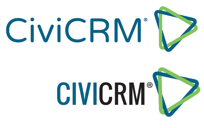
Now for the wordmark. Currently, CiviCRM uses Oswald font in all uppercase, and uses two different colors to differentiate between the “CIVI” and the “CRM” portion of the wordmark. The revision changes the wordmark font and the case, recommending a shift to NTR with a case that’s consistent with how CiviCRM is most often written, i.e. “CiviCRM”. By doing so, the revision is able to utilize a single color for the wordmark.
As a font, NTR is more symmetrical and open-feeling than Oswald. It is a sans serif font with rounded angles, making it consistent with the CiviCRM icon. Here’s a quick side by side of the recommended vs. current logo:

The combination of the wordmark and the icon, i.e. the “logo” has changed slightly as well. As you can see, the wordmark is larger in the revised version, which makes the icon feel smaller. The total height of the icon is 150% of the height of the wordmark, to be precise. Consistent with the overall more open feel of the logo, the distance between the wordmark and the icon has increased as well. Finally, the registered trademark icon has been reduced in size.
Thanks to everyone that contributed to this effort. The result is now visible for everyone to see and weigh in on. If you have feedback, please leave a comment or up/down vote here.
How will this be rolled out?
Because this is a fairly minor revision to the logo, we don't expect it to be swapped out in every possible place overnight. It will come online with the new website, as hopefully will a new overall style. Other materials will be updated on an ongoing basis.


Comments
Wow so much more goes into that design process than I realised. The icon part still looks the same to me :-)
You have rescued all of us geometry nuts who have obsessed over why the triangles' centroids don't converge ;-).