2020 Update: this blog post was a precursor to Mosaico, the newer CiviMail interface available as a CiviCRM extension which greatly reduces the complexity when creating responsive emails. This blog post is still very relevant to explain the challenges and importance of responsive email.
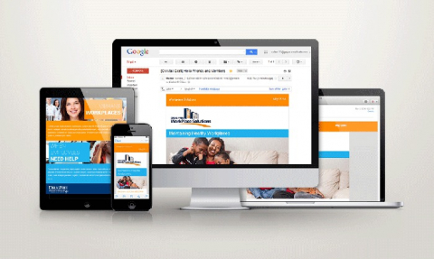
Let me start by saying that when I took over the CiviCRM newsletter project I saw an opportunity to update the overall design of the newsletter. At Arete Imagine no matter what we create, whether it’s a website, printed marketing pieces, social media, whatever it is, it has to follow some basic rules. It has to be practical, beautiful, intuitive, and it has to respect the end user. For me there were a number of areas of the CiviCRM newsletter which didn’t meet these key requirements. It wasn’t responsive so it wasn’t practical or intuitive for a majority of email users who check there email on mobile devices. It also follows that it did not respect the end user. This started me on a journey to find the best solution that would meet all of these requirements.
What exactly is a responsive email?
Email standards are at least 15 years behind web standards, meaning if designing a responsive web page to look beautiful in all major browsers is difficult, than designing a responsive mail to do the same is a nightmare.
Let’s take a look at some things responsive email is not.
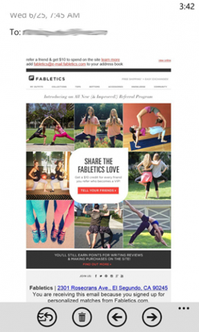
It’s not an email that simply fits to the width of your mobile device. Emails designed in this way do not resize text to a readable size, and they do expand columns to full width. It’s like someone simply takes a snapshot of the email and scale it down to a smaller size. This is not responsive behavior.
Example of what a responsive email is not:
A flexible responsive email that is designed mostly with divs and not with tables is not a truly responsive solution. Unfortunately for front end developers, no matter how much we love divs and css and how wonderfully they work for web pages, only responsive emails designed with old-fashioned tables work everywhere (including outlook).
A professor of mine once said tables were like 60’s style bell bottoms. Well, that’s about how far behind we are when it comes to email standards – we have to use one of the oldest tools in web design to design our email templates.
With all that to consider, some companies, large and small, have simply given up.
When I was tasked with creating a responsive email template for the new CiviNews email, I could not believe how truly bad the best of available templates looked in various devices.
Here’s an overview of the some of the many I tried:
Ink from Zurb. I was excited that these claimed to look good in outlook, and that I could have columns that resized to full width in a phone or tablet.
This is how my first template test looked in Gmail:
And in Gmail on a phone. The columns did become single width:
But it completely fell apart in Outlook:
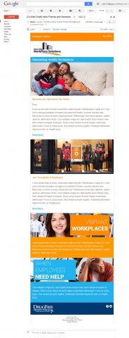
Next I tried a package of templates from Litmus. Since Litmus is a major email tester I figured these would work everywhere. I was surprised to find this wasn’t so.
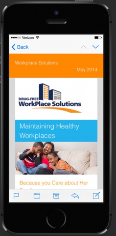
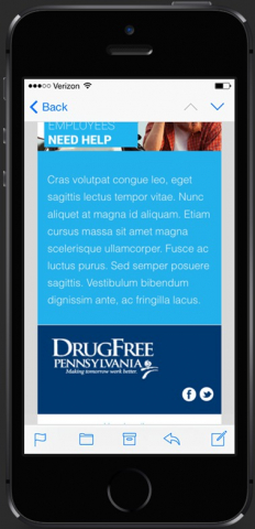
The email, which was a customization of one of the Litmus templates, did look beautiful in an iPhone and in outlook, but the images were not full width in the Android Device (Gmail App specifically). I was initially unaware of the problem during testing since neither Litmus nor Email on Acid had the Gmail App in the Android 4.1 and above device as an option to test (helpful).
Even though I found many references to this problem online, I did not find any solutions. The Gmail App in Android 4.1 and above simply dismisses much responsive email, a little like the Windows 8 phone, but not to the same degree. (It looked even worse on the Android than it did on the Windows 8 phone, due to the fact that it made my columns full width but not the images inside them.)
The Solution
I finally came up with my own solution. The pixel width in this particular combination is 330px wide, so I just made sure all my images (even the half column images) were 330 pixels wide and all media queries directed the images to be 330 at minimum. This changed the whole width of my email so I had to rebuild it yet again.
The final template, many tests and hours later, was more appealing than the Ink templates anyway, and worked beautifully in all tested clients and devices (a word on Windows phone 8 - because of the high screen resolution and rendering of responsive email coding, the email will simply scale down on this device).
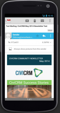
Desktop/Gmail:
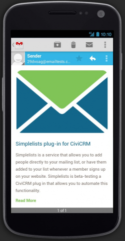
Gmail App/Android:
Here are some tips for designing responsive emails:
Keep it mobile first. Since most people view email on their phones primarily, you want to have a mobile first design (just like in web design). Limit columns to 2 – no more. You don’t want to deal with the nightmare of more. I recommend considering a simple one column layout, where all images are the same width. Then the only thing you really have to deal with is the font size. (See next tip). But even two column emails are quite simple to handle with some responsive coding.
An example of a single column mobile first layout is here:
Desktop:Gmail
IPhone:
Set your font size to a percentage of the viewport. Remember, an email that is displayed with desktop sized text is not really responsive.
I’ve created two simple email templates that work in almost all devices and clients. (The only one outstanding being the Windows 8 phone device I mentioned, caused by the high screen resolution and the rendering).
Both are based on a single column layout, but one has some double-column elements. The advantage of the double-column element layout is that you don’t need quite as high resolution images for those areas. The advantage of the single column layout is that it is simpler and much easier to make it compatible to ALL devices and clients (trust me there were times in this project I wished I had gone single column).
Both work well.
Where Can I test my own Email Templates?
Besides litmus.com and emailonacid.com, both with a monthly fee, putsmail.com can be a helpful free option, though it has fewer features..
So How Can I get these templates?
Excited about making your mailings work great on all devices?
A generic version of both of these templates will be included as samples in the upcoming CiviCRM 4.5 release. These templates have been tested above and beyond what Litmus and Email on Acid services could do for me, thanks to the help of friends who sent me screenshots and gave me feedback.

Marisa Porter is the Co-founder and Creative Director at Arete Imagine Inc. Marisa is passionate about the marriage of art and technology. Prior to founding Arete Imagine, Marisa worked with local non-profit organizations in various design capacities from brand development to unique web properties and tools. A few of the organizations she has worked with closely are: Goodwill of Central PA, The Whitaker Center, National Civil War Museum, Drug Free Pennsylvania, and ABWE.
She also worked at AHOLD USA in a web properties management capacity. Marisa’s role at Arete Imagine Inc is creating beautiful design and coding/implementing web based solutions.
Comments
Great stuff, I will have to try this. I have not been able to figure out why email clients have not evolved toward a standard in the way that browsers have.
BTW it is nice to see someone doing Civi in the central PA area. Keep up the good work.
Dan
It is very strange. CSS was introduced to the web in 1997. Though it's not perfect in all browsers, we're much further ahead than in email. Why isn't email just a webpage by now?
Though relatively new, we are happy to support to the CiviCommunity.
Thanks, Marisa, for this good looking work. I'm definitely going to recommend the starter templates to my clients.
I really hope they prove to be useful, Joe! Thank you for your kind words.
Hey Marisa,
Amazing post. Thanks for sharing all your work and for putting in the extra effort to allow these to be included in the upcoming 4.5 release.
Michael
Thank you for your kind words - I was happy to help and hope they prove to be useful to people. Also thank you for your help in testing.
Hi Marisa,
Thank you for the work. I've already needed to use it (got it here if anyone needs it) and the result was great.
Best regards, Diego
You're very welcome. I'm so glad this was helpful to someone.