Civisualize describes itself as The missing data visualization extension for CiviCRM, and provides a framework for sets of interactive charts to explore your data. It's an invaluable tool for dashboards, but particularly for exploration and questioning.

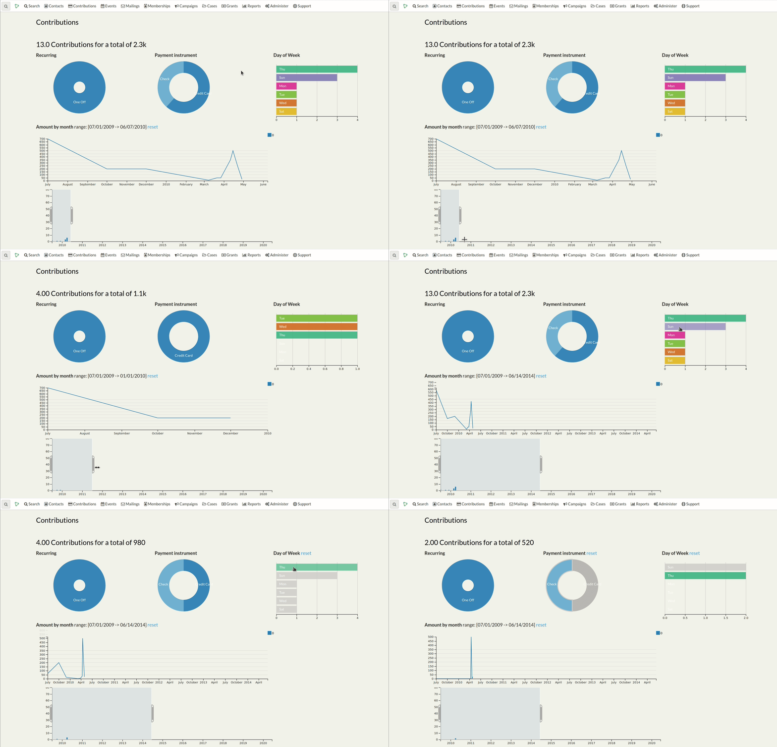
For example, here is an example of the built-in Contributions visualisation (the dataset is just a small test set - it's obviously more informative with real data!). As you can see, this shows me how people contributed, how much and how many, which days of the week, monthly amounts etc.
But I can click on any segment to filter all charts for that selection, so if I click on "Check" then I'll see the data for all those who paid by Check; if I click Saturday I can see if the breakdown changes on saturdays. I can click Saturdays, Sundays and Check to see how much came in at weekends - you can mix and match your filters; they all cross-filter eachother. The chart at the bottom lets me interactively select a date range, too.
It's also possible to add visualisations as dashboard widgets/dashlets.
From Data to Information: your needs will be unique
Your data is different to mine, and the information you need to do your work is different to the needs of other organisations. The stock built-in visualisations give you inspiration, but they're probably not what you want or need.
A developer can use this framework set up data visualisations that serve your needs, and you'll be richer for it. Having the information you need to see right there, clear, in your face and clickable, is a lot more helpful. It turns it from a chore to an informative glance, which in turn means you're more likely to use the information to better inform your decisions.
As a developer/implementer/looker-afterer and supporter of my clients, I will usually create one or two of these for them, based on exactly what they need. It's a bit of work at the start (if you're new to d3, dc, crossfilter there's a bit of a learning curve), but they take very little maintenance after that.
Real world examples of visualisations I've set up for my clients
Donations over time
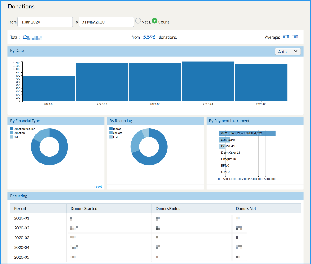
We Own It campaign for public ownership of public services in the UK (currently campaigning to save lives by ditching private contractor Serco who are failing to deliver on a COVID19 tracker app) and are mostly funded by their supporters. They needed an overview of their individual donors' giving over time and could not get what they wanted through the normal CiviContribute reports (or through the Extended Reports extension). I set up a visualisation showing £amount or number of donations (selectable which):
- totals
- per time period (selectable year/quarter/month/week/day)
- by type: first recurring donation (typically, new donors), repeat recurring donor, one off donation.
- by payment processor: Stripe, GoCardless, cheque etc.
I also added a table showing new, ended and net recurring contributions by month so they can keep an eye on their regular donor base.

This gives them an immediate overview of which direction things are going in, but more than that, with one click they can look at their one-offs, or their established regulars, or a new regulars in a particular month etc. as well as understand which payment services are most popular. Previously they had had a frustrating time running various searches and configuring and reconfiguring various reports to generate each figure, and then repeating that any time they wanted updates. The new report is described as brilliant and extremely helpful.
I have done a very similar report for openDemocracy but theirs focusses more on source of the donations - e.g. which mailing or link generated income, and which campaign is it for.
Breakdown of demographics of scholarship applicants
Windle Trust International provide (amongst other things) scholarships for people affected by war or displacement in East Africa to study at university. I set them up a data visualisation that lets them summarise the scholarships awarded by these dimensions:
- Country of origin of the recipient
- Place of study
- Course (thematic area and detail)
- Donor
- Educational level
- Gender
- Ethnicity
- Status of the scholarship
It's a lot of data, but as well as giving an immediate overview you can get explore questions with a couple of clicks:
- Is there a gender bias by country, by educational level, ethnicity - or any combination.
- What do people from Eritrea study? What about just post grad courses?
- What's the breakdown for a particular university, or funder?
New! updated! ... Oh, and it will break your old code!
Civisualize was given to the people by Xavier of Tech To The People and has been available for donkeys' years but I (Artful Robot) have recently had need to upgrade it because the libraries it uses (d3.js, dcjs, and crossfilter for those interested) had moved on significantly. The new version doesn't bring any new features out of the box but it does fix a few things. However it will also break existing custom visualisations. So if you rely on those, don't just hit update without a developer to hand. There's notes in the README for developers about how to update your visualisation templates; there's even a PHP script to do the bulk of the work for you though you'll still need to do some manual changes, too.
Artful Robot stitches CiviCRM and other great open source technologies into beautiful communication tools for campaigns, charities and other socially progressive organisations. We believe in sharing knowledge and ideas rather than squandering privilege and competing for market share. CiviCRM provides a great opporunity for us to build effective community-owned tools for change.


Comments
Thanks Rich. It's a great tool! Glad to see it being given some love and exposure.