Published
2014-10-03 11:10
Sadly all good things must come to an end.
Here at the CiviCRM 2014 Edale Sprint we've been working closely with members of the core team. As well as fixing bugs, working on integrating Google Summer of Code projects, and readying extensions for release, it's been an excellent opportunity for the Future First Software Developers to learn directly from the CiviCRM experts themselves.
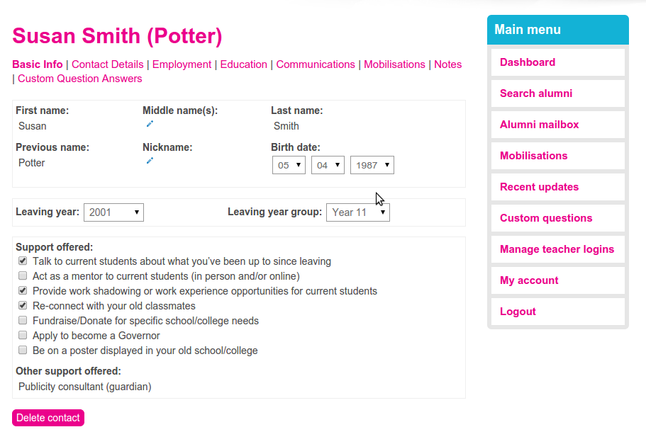
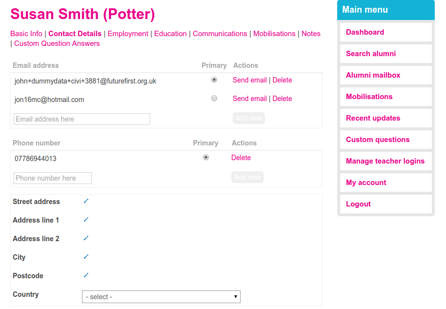
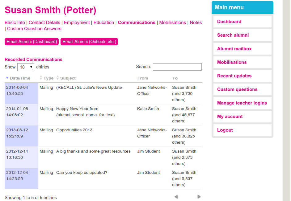
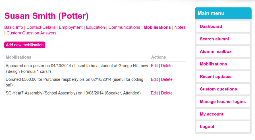
In a presentation I showed something that the Future First Software Development Team made recently - a brand new contact screen. It went down a treat, so here's a blog article revealing how we did it!
Background:
Future First is a charity that helps state-funded schools and colleges mobilise their former students for the benefit of their current students. Former students can do this by attending in-school events to inspire current students, by offering mentoring or work experience opportunities, by assisting in fundraising, or even by appearing on a poster displayed in the school!
A key part of Future First's offering is a Teacher Dashboard that teachers can log into to engage with their former students. This mostly involves an extensive search system and a communal inbox. It is built from a combination of Drupal custom modules and CiviCRM custom extensions.
The legacy:
Future First's Teacher Dashboard is a legacy system. Initially a screen was created to allow teachers to view contacts, based off a profile (with a separate screen to edit). Then notes were attached, so that teachers could add, edit, and remove notes about the alumni. When our Mailbox was operational we added each mail send to and from that alumnus to the profile screen too. Afterwards we added the ability to record mobilisations, so they made their way onto the screen as well!
The result was not pretty: an overburdened, messy screen that didn't allow teachers to view or edit all of the information that was being stored by CiviCRM. It was very slow, as all the mobilisations and emails had to be loaded just to add or remove a note. And everything had to be loaded once to view the contact, then again to edit it, and then a third time to see the saved edit.
It was time to start over.
The requirements:
Our main requirements were:
- fast
- have only one screen for both editing
- neater
- view and edit everything
- maintainable. Our system is growing rapidly, and the screen should be ready to support that.
The plan:
With three members of staff to work on the project, it needed to be modular. The data was broken into logical categories, and an api and template file was created for each of these. This structure translated directly into the different tabs.
Only the data on the first tab is loaded. When other tabs are clicked AJAX calls the API function for that tab. This retrieves the relevant data, which some jQuery then puts into the appropriate place.
Inline editing was used for each field. This feature, provided by the CiviCRM core, allows our users to view and update data without needing to move between different screens. Sadly, this didn't let us update custom data, so we patched it and offered our patch to the core!
The results:


contact_screen_1.png86.5 KB
contact_screen_2.png69.15 KB
contact_screen_3.png97.02 KB
contact_screen_4.png65.94 KB
Filed under


Comments
Was most impressed by your demo of this, John.
Cheers, Christian