Greetings from Apeldoorn at the Netherlands CiviCRM Code Sprint. I've spent the last several months meticulously working with the fundraising team at the Electronic Frontier Foundation (EFF) to build donate pages that look and act beautifully, remove friction from the donation process, and leverage premiums to get bigger donations.
At the England and Netherlands code sprints after CiviCon London I spent most of my time building a lot of the functionality that I've made for EFF into CiviCRM Core and updating the default contribution page templates. These new contribution pages will be part of the 4.3 release.
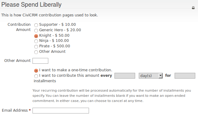
Before
I'll start with screenshots from a contribution page in 4.2. Here is the header and some price sets, where you get to choose your amount, choose if you want to make a one-time contribution or a recurring one, and enter your email address:
Here's where you choose which premiums you want.

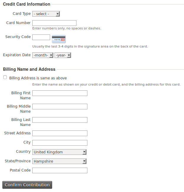
And here's where you enter your billing information and credit card details. Note there's a "Billing Address is the same as above" checkbox, which is a great feature that was just added in 4.2.
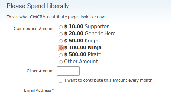
After
After the code sprints, contribution pages look a lot different.
Contribution Amount and Recurring Contributions
Starting with the top of the contribution page, I've made the price set labels bigger and emphasized the currently selected price set. I also did a lot of work on the recurring contribution block. I've replaced the radio buttons with a single checkbox, and there's no longer lots of extra text explaining how to cancel your contribution (this info is in the email receipt). I've also removed all the extra options that are presented to donors by default.
If you scroll back up to look at the old recurring block, it asks you for a recurring interval and how many installments you want your donation to be for (leaving this blank is infinite). Here's the old default recurring settings:
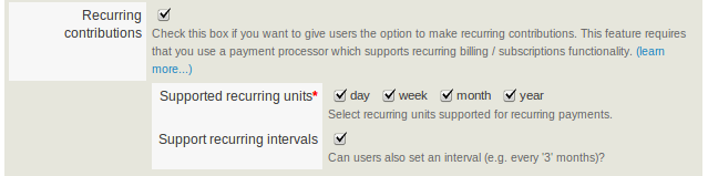
By default, all of the recurring units were selected, but most organizations don't want all of these. "Support recurring intervals" was checked by default, which most organizations don't need either, and helps to clutter the form.
Here's the new default recurring settings:

I've added the "Offer installments" field, and it defaults to being unchecked. When this is unchecked, the installments field doesn't get displayed. I've also changed the default behavior so that month is the only recurring unit checked, and "Support recurring intervals" starts out unchecked.
The new design still offers selecting multiple recurring units, recurring intervals, and installments like before, but it just only displayed fields if they're necessary.
Premiums
My favorite part about the new contribution pages is the premiums:
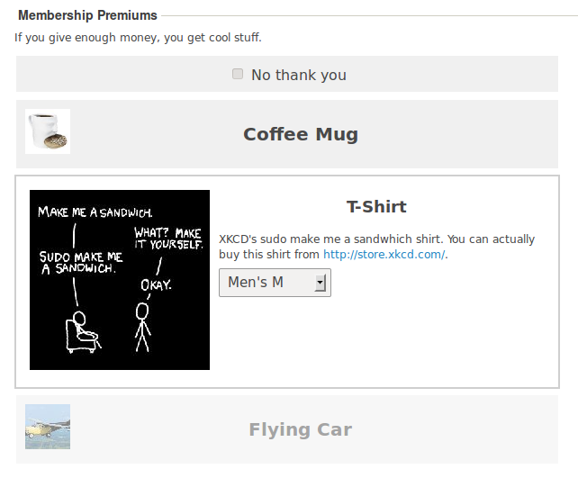
You no longer use radio buttons to select your premium. Instead a short version of the premiums gets displayed with only the thumbnail and name, and when you click on it it expands into a longer version. All of the premiums get displayed, but ones that the donor can't afford with their currently selected amount are grayed out. They can still click on them to see the larger image and description though:

If they have selected a premium they can't afford, there's now a button that changes their amount. In this example, if you really want this flying car, you can click "Contribute $250.00 Instead" to automatically change your contribution amount. Since $250 is not an available price set on this page, it will select Other Amount and put $250 in the other box. If there were a $250 price set, it will select that one.
While I was changing the premium image upload code, I started using the PHP function imagecreatetruecolor instead of imagecreate. You won't have issues with losing colors when you upload a premium image anymore.
Profiles, Billing, and Credit Cards
Here are what fields on public CiviCRM pages look like now:
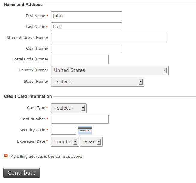
They're bigger and they have more padding. In the Credit Card Information section I've also removed unnecesary text. If you look at the old Credit Card Information block, you'll notice it used to say "Enter numbers only, no spaces or dashes" under Card Number. Now it uses JavaScript to automatically remove spaces and dashes when you enter them in the Card Number field. And it used to say "Usually the 3-4 digits in the signature area on the back of the card" below Security Code, but now this only gets displayed as the title of the security code image, if people mouse-over it.
I wanted to remove the Card Type field altogether though, since it's actually not needed at all. You can tell what type of credit card is being used by the first digit of the card number. Instead I wanted to just display the logos of the payment processor's accepted credit cards. But sadly I ran out of time at the code sprints. This is still a good idea!
Like before, the new contribution pages have a "My billing address is the same as above" checkbox. But this time if this box is checked, all of the billing fields are hidden. Since most people use the same address, there's no need to show them the other fields. Clicking the checkbox before used to just copy the profile fields into the billing fields, so if you go back and change a profile field it won't update the billing field. Now this checkbox sets JavaScript onChange event handlers to always keep the profile and billing fields synced while the box is checked.
And finally, the button just says "Contribute" instead of "Confirm Contribution" and the font size is much larger.
Design that pays
When someone ends up on your contribution page, it probably means they're thinking about contributing but they haven't yet made up their mind. Your job as a non-profit is to make the donation process as painless and quick as possible. You should remove all unnecessary text, fields, and even distracting links like your navigation bar (*ehem* https://supporters.eff.org/donate).
One of the earlier EFF additions to CiviCRM was the "Use a confirmation page?" checkbox we added to the admin interface of contribution pages in 4.1. After someone has decided how much they want to donate, filled their personal information, and even entered their credit card number, they have made their decision to give you money. The confirmation page gives potential donors a chance to change their mind after they've already made their decision.
Make your options big and easy to understand, and make it clear what people get, or what their impact is, if they contribute more. Don't make them fill out anything more than is necessary. Asking me to enter my age or sex might annoy me or give me second thoughts about donating. If you do want to collect extra optional information from your donors, consider hiding that profile by default so people who just want to give you money without any hassle can donate and get it over with.
I hope that when CiviCRM 4.3 becomes stable and organizations around the world start upgrading their donor bases will grow because of this work.
Comments
Way better that way, thx.
Quick suggesquestion: have you added the amount in "jQuery readable" format?
It's often that the contrib page needs to know the amount selected by the user to do some additional magic, for instance in France to calculate what is the contribution amount once you take the 66% reduction from your tax return.
https://crm.wikimedia.fr/civicrm/contribute/transact?reset=1&id=2
So far the solution was to parse the text massage it to extract the amount, but would have been easier/more readable to have a data-amount="30.00"
It has no use whatsover out of the box, but makes customisation so much easier to have data on an easy to read format
X+
looks great -- thanks for implementing these improvements.
piggybacking on Xavier's comments -- it would be great if we can also ensure that the different "blocks" of content have consistently structured html. in particular, I would like to see each block wrapped in a fieldset tag and given a unique id. that allows for more consistent layout and more theming/templating control.
Xavier, yeah I found the price set fields' data-amount attribute to be really useful. I added extra attributes like this for premiums too so it's easy to get their prices and minimum contributions.
As far as the amount entered, figuring out what that is with javascript is actually trickier than it at first seems. The amount is either defined by a price set radio button being checked, an "Other Amount" radio button being checked with the amount in the Other Amount text field, or in the case of membership pages with the "Separate Membership Payment" box checked, it's the value of the checked radio button plus the value in the other amount field. It's also possible that there's no price set default, or that there's on the other amount field and it hasn't been entered yet, in which case the amount is undefined.
I made a get_amount function that does all this however it's not in the global namespace so extra code won't be able to use it. Maybe I could attach an amount attribute to something and add onchange handlers to price set and other amount input fields to update it?
lcdweb, having well structured html with predicatable ids is a great idea. I think that it's not all that bad right now, especially with the improvements on the premium block. I'd have to double-check to make sure all blocks have their own ids thuogh.
i do love the new design of the contribution pages, however a feature was lost on what is now the contribute button.
It used to function great with the "Confirm Contribution" changing to "Processing" upon click. Preventing multiple clicks of the button and thus duplicate transactions in the back end.
Since this change we have had multiple issues with people clicking the Contribute button twice and creating two contributions.
It would be REALLY GREAT if this functionality was returned!