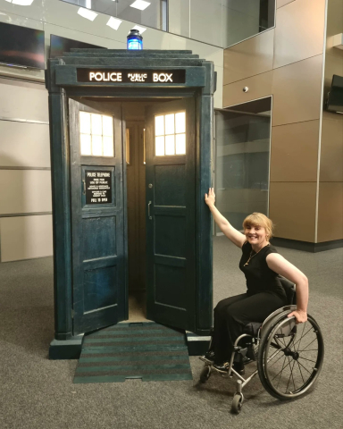
featuring the newly-accessible Tardis)
Arriving at a hotel in Germany before Christmas I was met with a flight of stairs to the front door. As a newish dad with pram, my first reaction was ‘this place doesn’t like people in wheelchairs!’. I didn't think much about this before, but since last year I’ve noticed how much of our built environment excludes people needing wheels: from train stations and offices, to cafes and venues, so many places are inaccessible to someone in a wheelchair.
It’s not so different online – accessibility is something we often don’t think about until forced to (by client/boss/colleague or sudden impairment). But unlike buildings where some places can’t fit a ramp or lift, there’s no reason not to make a new website or app accessible, beyond time and effort. It gets trickier, however, with a 20-year old piece of web software like CiviCRM, built with a range of front-end technologies.
There have been many attempts to improve Civi’s accessibility limitations over the years. Most notably, almost seven years ago, Rachel Olivero, then Director of Organisational Technology at the US National Federation of the Blind (NFB) flagged some problems on Stack Exchange about CiviCRM’s accessibility. The NFB have been using CiviCRM since 2015 for member, donor and subscription management, and Rachel, herself blind, highlighted a number of Civi’s failures from the menu, to Select2 lists to Accordions (regions of a screen that expand/collapse when you click on them).
Tragically Rachel died in 2019, but she had such a significant impact on web accessibility that Drupal named the Olivero theme after her – the replacement for Bartik shipping with every Drupal 10. Joe Murray and others took some of her suggestions forward helping to rejuvenate Aidan Saunder's accessible/responsive menu project I'd worked with him on at my first sprint in 2017 – and which became part of core with the efforts of Coleman. But work on accordions faltered, until her issue with Civi’s inaccessible accordions got a new injection of life in the 2023 Sprint. To be clear here, ‘inaccessible’ doesn’t mean hard to read or ugly – it means the accordions can't be opened by someone using a keyboard to navigate, so the contents stay invisible.
CiviTheming, or How do we make Civi look better?…
Before going into how we started to tackle this, I should introduce a project that began over a year ago. It led from one the most common questions in the Civiverse, how do we make Civi look better? Josh Gowans messaged one day and asked ‘what would it take to bundle Finsbury Park (my CiviCRM theme) with core as a default theme?’ I struggled with the fact I’d hacked it together in lockdown from the original civicrm.css file, and don't think that’s written well enough to ship to 12,000+ Civi instances. Aah, on the other hand, Rich 'ArtfulRobot' Lotts’ Civi theme is minimal and much more cleanly written.
You can see this in the size: Aah’s main css file is 42.3kb big, while Finsbury Park is three times bigger at 124kb. A difference is that Finsbury is tested on all six CMS setups (soon to be seven with Standalone), while Aah just works on Standalone and Drupal. Shoreditch's main CSS file, for comparison is thirty times bigger at 1.73mb (The Island - a more up-to-date branch of it, that also works on WordPress - is already 2.27mb).
Rich and I discussed the common challenges we've hit theming Civi and, encouraged by Northbridge's Oliver Gibson, Josh agreed to support us both to explore the question of how to improve how CiviCRM looks out of the box and produce a plan. We had plenty to discus, grumble about and ponder.
Hanging wallpaper on really old walls
I started to see Civi's interface as a bit like an old building. The first bricks were laid in 2004, making it — in web years — like a medieval cathedral. But it's used for a few thousand different purposes, with every kind of room, many with their own brickwork, ceiling height, and style of doors. It’s had to support three design eras (Drupal, Joomla & WordPress), like a Roman-Tudor-Modernist mashup. Different construction trends have been used over the years, from Smarty and jQuery to Angular and FontAwesome – leaving the walls a mix of concrete, wood, exposed brick and wattle-and-daub. One of the more recent attempts, Bootstrap 3, arrived in 2014, meaning its once fashionable Verdana headings and tiny font sizes now feel a bit dated (or in web-years, like a 70s shopping mall). In other words, change takes time and can be outdated by the time they arrive - so we stick with Greenwich, the theme created over a decade ago for CiviCRM.
And any attempts to retheme Civi start from this tech debt. The most successful attempt by far, Shoreditch, with over 3,000 installs, brought in a designer to create a beautiful wallpaper, followed by a painstaking 7-years-and-counting task of pasting this wallpaper over a myriad different wall surfaces. This is a common problem for every themer - which is why the new themes since (Aah/Finsbury/Haystack) have taken a different approach of working with Civi's markup to make it look better, styling up from the base, rather than trying to enforce a design scheme on top of it.
Rich and I decided that given how much refactoring of Civi’s interfaces is happening through SearchKit and FormBuilder, we should look at improving the walls at the same time as hanging new wallpaper, so that hanging wallpaper gets easier. It's inevitable in 5 or 10 years there will be desire for a new look-and-feel, so lets make the process of retheming more future-proof, especially while so much markup is being improved as much of Civi's user interface is being replaced with SearchKit and FormBuilder screens. This becomes even more of a priority when thinking of the 1000s of CiviCRM extensions whose UI has borrowed from multiple CiviCRM eras.
Walking the DINOsaur
Our idea has four steps (which, inspired by Civi's LeXIM, we call DINO):
- DOCUMENT the multiple markup variations for all of the different UI elements in CiviCRM in the ThemeTest extension which Rich had made. Each markup pattern is a snippet of HTML – so we can look at each of the thirteen ways to make a button. Each pattern gets labelled 'recommended' (use this!), 'supported' (themes should support this but one day might not), 'deprecated' (don't use this!).
- IDENTIFY a best practice version of each UI element to recommend in the Civi UI Reference Guide. If this is different to existing patterns it can be added to ThemeTest initially as a snippet marked 'prototype'.
- NEW theme / NOTIFY themers. Add the pattern to a new theme, and notify themers of any changes needed.
- OPTIMIZE Civi's markup to use the best practice markup - and remove all the old markup.
There was very little response to publishing this idea as a wiki and Gitlab issueboard beyond Eileen asking how to get started. This led to an annoying, ‘here’s a long answer to your question’ reply from me which became an even longer issue outlining Civi's eight accordion patterns and hypothesizing how to reduce that while making accordions accessible, without breaking existing themes or extensions.
Playing the accordion
At the last minute I decided to go to the sprint in Derbyshire last Decemeber, to try and answer the question properly, building consensus with the core team members there about how to make Accordion UI elements accessible (of which Civi had eight different markup patterns), and then following up with PRs. Best of all it would be a chance to test DINO and simpler than theming discussions which end up in a debate over frameworks, fonts, colours, or design libraries – everyone can agree accessibility is a priority for CiviCRM. Oliver Gibson pointed out ahead of the sprint, accessibility is a requirement in almost every public sector tender they make, and clients often list it as up there with have a responsive website and documentation.
While thinking it would be simpler than making a theme, the process of testing DINO illustrated for me how hard it is to improve things when you need to support the tech debt of a theme, the extension ecosystem, and the challenge of users using older themes than the version of Civi they are on. Fix things and don’t break stuff was our goal, forcing lots of contortion, not least in trying to support the 1000s of users of Shoreditch who aren’t getting many updates to their theme, but since our changes appeared in 5.69 and 5.70 nothing seems to have broken. What did we do?
- Document - we documented eight patterns of accordion markup used across Civi (since grown to ten)
- Identify - with core team, we agreed to using the HTML elements details/summary for accordions as they are both accessible and don't need any Javascript.
- New theme / Notify themes - documented the changes so themes could handle them. This included changes to CiviCRM’s core CSS.
- Optimise - Coleman and I then went thru and updated examples for seven of the eight patterns and replaced at least one instance of each with the new pattern. In a couple of cases (SearchKit and FormBuilder) this means the old pattern could be completely deprecated - so there's only five different patterns now! In other cases there are dozens of the old pattern still sitting in Civi’s code, which will take the diligent work of the community to go thru and cleanup - hopefully at a Sprint this year. But it's a start.
Where next?
While December's sprint was the most productive one I've been to since my first it felt if anything it just revealed how much there is to do. These would include:
- encouraging the community to open PRs moving Civi's accordions to the new accessible pattern
- continue the process of Documenting, Identifying, Notifying and Optimising markup for other UI elements (dialog boxes, notification, tabs, buttons, etc)
- develop a new theme to bridge the old markup and new, the old Civi UI and the new Civi Search Kit and Form Builder output.
- raise funding from partners and community to support this.
Comments
Great post, Nicol!
I think the social model of disability - the idea that it's not people's bodies that disable them as much as a society that has made decisions that have made things inaccessible - applies here too.
As someone with good eyesight (because I can access glasses) and who loves things that look nice and are nicely layed out, it's very easy for me to build something for people like me, thereby excluding others. And people like me say Oh nice work, while others are silently excluded. This becomes self fulfilling because those for whom a design doesn't work end up finding something that does, further concentrating the number of "people like me" left to make more choices that work for people like us.
So, for example, in CRM, we have a lot of data to display. How to fit that to different sized screens? How to give priority so it's clear which bits are important? A common method is to use tiny fonts, muted colour contrasts, icons instead of words, and buttons that change their text when clicked/tapped/activated. Visual users with good eyesight love this stuff. But it comes at the cost of excluding those whose eyesight is not good and those who access web content by screen reader tech.
Technology is never neutral: as long as it's designed and used by people, those people's values, abilities, priviledges and prejudices will be present.
My theme, Aah, tries to keep some of this in mind, but it hasn't had a penny of funding and it has been hard because it's papering over all that's come before and you're very limited in what you can do - we need to tackle this together at a deeper level, as you eloquently explain.
Thanks, Nicol, for all the energy, time, patience, work that you have put in to moving this initiative forward.
Thanks Rich!
Thanks for helping to lead us on this community journey. One community pattern that helped us overcome immense debt in the past was @eileen gentle and differentiated encouragement that became requirements for some experienced people to submit tests in order to get patches accepted. In a state of scarcity of resources, we could use some sort of carrot / stick approach to incentivize fixing a certain subset of problems.
Another example was when we were trying to clean up the toxic code in the accounting area people had to show they were making an improvement to get changes accepted in that area of the codebase.
I think focussing on one area of theming, like getting accordions to work, might benefit from a similar approach. It would likely be a good idea to kick this off at a Sprint where a bunch of people collaborated on rolling out a pattern of changes that leaders have gotten prior consensus on. So tackle high priority parts of interface for accessibility first, like accordions then perhaps menus (again), and try to keep the momentum going.
I'm going to speak to each of you about funding you to continue your great work.