Has your constituency base increased more at the start of last year or this year? Is your organisation receiving more contributions on weekends or weekdays? Does your event has more participants than it had last year? I am pretty sure all of you must come across these questions and with the number of features CiviCRM offers the number of such question is very big. In this post, I will be talking about my Google Summer of Code project and is excited to introduce you all with Civisualize, an extension which can surely help you answering most of the above questions and a lot more.
Hi, I am Siddharth Gupta, a fourth year undergraduate at IIIT Delhi, India. I have been selected for Google Summer of Code 2014 for Ready to Use Data Visualizations - CiviCRM mentored by Xavier Dutoit from Tech to the People, Gordon Woodhull from AT&T Labs and dc.js and Max Hunter and Electronic Frontier Foundation.
I would like to start this post by talking about a JavaScript library, dc.js, which uses the power of d3.js to create multi-dimensional data visualizations for a easy and efficient exploration of large data-sets. The one most attractive feature of dc.js it let you filter the data just by clicking on a graph and the rest of the graphs are transformed accordingly. You can find more about dc.js here. Most of my GSoC project revolves around using this library to create data visualizations for CiviCRM.
Some dashboards in civicrm already have graphs/charts. As a part of my project I am trying to improve the interaction of users with these graphs, giving them the ability to filter through the data with their help. We planned to create an extension which will allow organizations to have dashboards with ready to use data visualization and the developers to create custom visualization with a little knowledge of d3.js and dc.js. Xavier has already been working on Civisualize, and thus we continued with what he has already done. One visualization which was already there was for contributions, and we started with creating new ones.
We understand that different organizations need different type of visualization and we can not cater to needs of everyone so I am trying to create generic visualization which will help the most. With that in mind I and Xavier, after discussion with the community decided to begin with creating visualization for Contacts and Events.
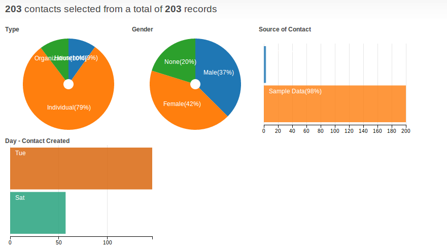
For Contacts dashboard:
The contacts dashboard was the first visualization I started working on. As I was new to dc.js as well as civicrm and it came with a lot of learning. The contacts overview page is a dashboard showing the following
- Pie chart for contact type.
- Pie chart for Gender.
- Row chart for source of contacts
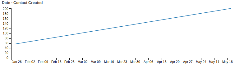
The other interesting thing we tried to visualize was when was the contact created.
- Row chart with day of the week of contact creation.
- A timeline for org telling how the contacts were created over the time.
Now we did face few challenges during the process. Firstly one thing we noticed was the number of sources for contacts are sometime so high that we hardly notice the rows. We are currently looking for a solution to this, one proposed solution is a tag cloud, but if anyone of you have a better solution, please do suggest that to us. The other thing you can help us is suggesting some other graph or dimension that can show interesting data. We have a forum here post where I post updates about what all is happening in the project and you follow the same.
Xavier and Erik Hommel from CiviCoop also organized a webinar talking about Data Visualization, discussing the features and its possibilities in the future. You can find it video here.
For Events dashboard:
Events have a little complicated structure with much more attributes than Contacts and in some way it also comprises all the attributes of the contacts as well. Now, after a lot of discussions with my mentors and other developers on the forum, we came up with the following points.
- Most of the people want everything at one place. If given an option people would like to see all events instead of different group of events on different pages.
- Option of comparing two events can be interesting. The issues with same is the comparison is dependent on organization to organization and event to event.
- One more thing which we realized was having all the information on the same page is very cumbersome.
So, after a lot of discussion and lot of additions and deletions, we came up with the a new structure for the events page. The total information will be divided into two pages, one for the overview for all the events. The other page will contain information about a particular event.
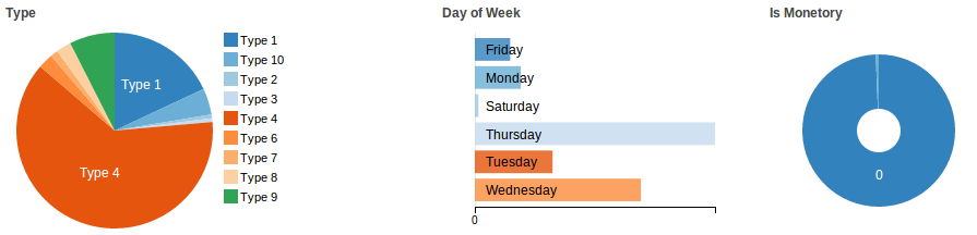
The page which shows the events overview, with following information.
- Bar Chart of Events
- Line Chart of Participants per Event per Month.
- Type of Contact
- Day of week of the event
- Pie Chart for Monetary Events
- Data Table Listing all the events.


The other page will be an individual event page, which will be showing information and demographics of participants. We are currently working on a secure way to extract data with parameters using SQL. You can currently find our extension here.
With the above two ready to use visualizations and a visualization for contributions, Civisualize also act as an easy framework for developers to create their own organisation specific visualization. This can be done in two parts, extracting data using crmSQL or crmAPI and visualizing it, by creating a smarty template.
Google Summer of Code was one of my first interaction with the open source world and I am learning more and more every day. I am trying to make my previous projects open source and at the same time contribute to others. I am also trying to contribute as much as I can for dc.js and is also looking forward to use JavaScript chart instead of open Flash Charts in CiviCRM. Please comment with your suggestions.
Important Links
Comments
Your progress so far looks great! I can't wait to try it with a production database when its ready.
Question: Is this going to be tied in to CiviReports? I have a feeling the users will want to choose what data elements they want to graph. (There is already a very basic graph available on the report template named "Donor Report (Summary)" - I think this uses Open Flash Chart)
Hi Sarah,
Would be awesome that you try with your own data, the dataviz Sid has done are hopefully good enough already.
As for the report, Eileen has already a way to extract the data out of the report so they could be pushed to civisualise, hopefully we can look at more of it.
X+
Ooooooooh :)