Hi, I'm Siddhant Rajagopalan, a second year Undergraduate student studying CSE from IIT Bombay.
As part of my GSoC 2014 project which is to improve the usability of CiviMail, I have come up with 2 mockups. I would appreciate feedback regarding which mockup would be a superior fit.
Aim of the Project
Browser based applications are becoming the de facto web standard. CiviMail is an important component that has a high impact. Current workflow in CiviCRM is lengthy and multi-step process. It would be easily converted into simple javascript application, using modern framework such as AngularJS. AngularJS is a leading javascript framework and building on it should be a good example for future CiviCRM usability improvements.
Research Link: http://wiki.civicrm.org/confluence/display/CRM/Research
UI Mockup
After researching various competitors in sending bulk mailing, I have come up with 2 UI versions of mockups.
The mailing interface will now act as a single page application.
It will be written in Angular JS, a JavaScript framework.
UI Mockup 1
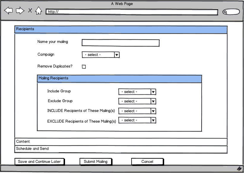
This mockup is in the form of an accordion.
Here is a link to the complete mockup.
http://wiki.civicrm.org/confluence/display/CRM/UI+mockups+1+%3A+ACCORDIAN
UI Mockup 2
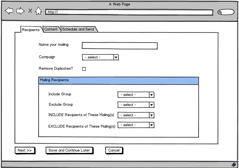
The mockup is in the tab format.
Here is a link to the complete mockup
http://wiki.civicrm.org/confluence/display/CRM/UI+MOCKUP-2+Tab+form
Advantages of accordion format (UI Mockup 1) over current civiMail UI
The entire civiMail will be loaded onto a single page.
The accordion will have 3 options instead of the original 5
Track and Respond and Mailing Content will be merged, as will Test and Send and Schedule.
When all the required fields of a particular bar of the accordion have been completed, a check mark will appear for that bar to signal completion.
The save and continue option will be more dynamic since we can do portions of all steps, without having any completed and save the mailing in that state. Earlier if we were saving after doing a portion of step 3 which in that case was mailing content, step 1 and 2 needed to be completed. That restriction no longer exists.
So if we are unsure about a particular field in a step, we can move on to further steps and save the mailing. We can then go back to the aforementioned field at a later time.
An accordion ensures there is no need for a previous and next button, since everything is happening on the same page, simply by selecting the appropriate bar.
Advantages of the Tab format(UI Mockup 2) over current civiMail UI
The tab format of UI mockup 2 is a single page application.
This means we can go from one tab to another without the page reloading. Unlike current civiMail UI, the tabs are interactive.
Instead of 5 tabs, there are only 3 tabs. Again Track and Respond and Mailing Content have been merged along with Test and Send and Schedule.
In the current civiMail UI, if we want to go from Select Recipient to say Schedule and Send, we need to use the next button multiple times to carry this out. This becomes tedious and is not user friendly.
However in the format of UI mockup 2, we can do this directly, by just clicking on schedule and send in the tab bar. Thus we are making the tab buttons interactive.
Since it is a single page application, this will happen without the page reloading making the UI user friendly.
Even in this format, the save and continue button will be more dynamic than the current civiMail UI.
Comparison Between UI Mockup 1 and UI Mockup 2
Both accordion and tab format will behave as single page applications.
In the accordion format, we can see all the steps of the mailing process on the same screen.
In the tab format, at a time we can only see one particular step of the mailing process.
The tab format shows the user less information on one screen. The accordion on the other hand shows all the information which can get confusing.
However, seeing all steps of the mailing on the same screen can also be an advantage
The accordion format gets rid of the previous and next button which the tab format does not do.
Visually, the tab format will look similar to the current civiMail UI, so current users will not need to adapt.
The accordion format will be a complete change.
Thus both have advantages over one another.
Plan for next 9 weeks
Week 1-3:
1. First prototype of the new CiviMail UI
2. Minimal set of tests to ensure working of the prototype
Week 4-6:
1. 2nd iteration based on the feedback from early alpha testers
2. A blog post with details of the new version and requests of feedback from the community
3. Deploy a public demo instance
Week 7:
1: Document work done
2: Create plan to migrate other civiCRM components to a similar framework
Week 8:
1. Testing and bug fixes
2. Merge new code into CiviCRM master
Week 9:
1. Project wrap up and buffer week
2. Final blog post: Learning, what’s achieved and roadmap for further improvements
Way Ahead After the Project
Researching various bulk mailing systems has shown that responsive templates are an essential feature that civiMail is missing out on. The user should be able to build these templates easily using something like drag and drop functionality.
Have ready made templates for various kinds of bulkmail, like newsletters and announcements, or surveys and so on.
Using civiMail as an example, model the entire civi UI using AngularJS since it is the way forward and it is much more user friendly.
Comments
Hi,
Was wondering were was the track and respond and realised you "hided" it under content. It didn't feel intuitive to me, might be better to put it again as a top accordion/tab.
(general UI thing: adding more depth to avoid more width isn't simplifying, especially if you have a UI that allows you to jump between steps like your suggestions)
Similarly, I wasn't expecting "name and campaign" to be in the recipient, might be better to put it elsewhere. IF it is possible, putting it in send might make more sense (as it's basically like you are saving a file that you need to give it a name), ideally you don't have to type it, it can automatically take the info of the subject by default
What happened to the counter of recipients? it's super useful to know how many recipients to validate you chose the right groups/campaigns.
and lastly, don't forget the mailing from a search result (schedule send a mass mailing), would be great you see how it could fit, the interface is slightly different than the normal mailing
But definitely getting in the right direction, well done
X+
I noticed that the group section is a single selection. This removes a functionality that the current system has, selecting more than one group for each section. A change in UI shouldn't remove functionality.
I guess he's planning to use the Select2 component. It looks like a single select but, once you choose a value, it appears as a little box with an "X" (that allows you to unselect this element) and you can chose more elements.
You can see the component working at the bottom of the New Contact form, when you choose the groups where you want to include your contact (I'm not sure since what exact version but, at least, since 4.4.5).
You can also see it working (with a different style) under the "Multi-Value Select Boxes" here: http://ivaynberg.github.io/select2/
Anyway, I agree with you: we still need to be able to choose more than one group for each of these fields.
Yes, I plan to use the select2widget. So I'l be able to choose multiple groups for each field even now.
After choosing one group, it appears as a little box with an "X" (that allows you to unselect this element) and you can chose more elements as capo said.
Do you have more about the competitors? What did their UIs look like.
One thing I've heard people say in the past is that they want to start with the mail composition - was that said anywhere?
In general a nicely themed accordian seems more modern to me than a tab format - but the theming would need to look modern. However, I'd really like to have some more examples / detail about what else is in use - which competitors did you investigate?
Hey, I have updated my research link to show the other competitors I looked at.
http://wiki.civicrm.org/confluence/display/CRM/Research
The mail composition option is first in Mailing System B.4, which is Vertical Response.
http://mailchimp.com/
I signed up for a mail chimp account to see & although the screenshot on their first page looks nice I didn't find the over-all experience very good - still interested to compare. They use something that looks like an accordian but actually 'slides' into the main space (& you can slide it out again) - that certainly conserves real estate - although opinion about the 'back' method would probably be divided
Looking at the mockups at http://wiki.civicrm.org/confluence/display/CRM/UI+mockups+1+%3A+ACCORDIAN I am a bit concerned about the Submit Mailing button at the bottom of all the UI Examples --
I hope that it is a shortcut to Schedule mailing - which will change to Submit when on the Schedule screen ...
Seen to many people hit sent before they were ready
Hi,
I thought the nested accordions were less intuitive than the tabbed accordions.
Ken
e.g some discussion here
http://ux.stackexchange.com/questions/23181/when-is-it-bad-practice-to-use-an-accordion-control
I was looking to see if there was a really good example of a great complex form - but haven't found one yet. I also tried googling images for accordian - a few examples but haven't spotted one that inspires me yet
BUT, the question that springs to my mind is how will the form work on a mobile phone/ tablet or whatever? I notice MailChimp makes it clear their form is cross-device & of course we should be designing with that ambition
Just thinking about the future, it would be a nice idea to clean the Content tab as much as possible. Now, other emailing platforms (as MailChimp, or SmartFocus), are providing very nice drag and drop tools to dynamically create the body of the emails.
SmartFocus
MailChimp
I suggest leaving as empty as possible the content tab, so in a close future we can more easily add such a functionality. Currently, this tab has also a select that allows you to choose the From address. I suggest moving this select to the Schedule and Send tab.
Hi Siddhant,
Great to see some potential changes coming to CiviMail!
We work with a partially sighted user who uses Jaws to access CiviCRM. From his perspective, the tabs along the top are much better as he can more easily tab across them and get directly to the section he wants to work on. When sections are in the accordian, he needs to tab through every field in each section. This would mean if he put together the mailing but wanted to come back to just send, he would have to tab through every field to do so. The tabs along the top would allow him to tab directly to the Schedule and Send section.
I'd also suggest making the Plain text section required if possible as part of this work. You'd be shocked at the number of users who don't know it's there or why!
I agree with Xavier that it would be good to have the track and respond section as it's own tab still. It's a section people recognise and it might get lost if just added into another section.
Heather.
Some suggestions:
Thanks a lot for the feedback. The mockup really helped understand your point.
I'l try to incorporate the changes
Hi rajgo94,
It would be really helpful if you could post a revised mockup so the work on Voice Broadcasting could mimic your efforts.
Ok - I agree with Tim's comments - they reduce the number of fields on the 'simple' display - which is great! & also the number of tabs.
This may be out of scope - but for some of the settings it makes sense to have a site-wide default & to hide from users if is set (or possibly if it is forced) - if it's not part of your UI I would eventually expect to see if emerge as an extension. I don't have any specific thoughts as to how this might influence your design - although it seems people might want to use a hook to drop tabs/accordians if they have 'defaulted-away' all the options on it
I would like whatever is coded to implement this UI to be designed in a way that is easily reusable for similar functionality for bulk SMS and Voice broadcasts. Perhaps a service container could be defined for a 'communication channel' that could support mail, sms and voice. The big difference as I imagine it would be in the content section, while the scheduling / sending would be the same, and there would be different options in specifying the to and from info for each channel, though the main fields for selecting include and exclude grups would be shared.
I would be happy to discuss this with Kurund and totten along with Rain who is the GSoC student working on voice broadcasting.
I think CiviCRM needs a JS MVC framework and there are good reasons to think that Angular should be the choice. However, there hasn't been any in depth discussion or consensus developed around this. I've started a discussion at http://forum.civicrm.org/index.php/topic,32957.0.html and would like people to contribute their ideas there. It would be a shame to develop this in Angular but not end up being able to use the code if, for example, a decision was later made to follow Drupal in choosing Backbone over Angular.
If the objective is to send many email messages please consider adding tags to the interface. I realize mail can be associated with campaigns, but that is often overkill for organizing relatively simple mailings. Even if this is not added in phase 1, please consider it may be added later ...
Hi Siddhant,
Great work! Just a couple of suggestions:
1. On the Track and Respond screen, is there an argument to make the Online visibility 'Public Pages' by default? Most CiviMail campaigns are used for outward facing communications, and users keep selecting this option anyway. I'm not sure if the default is User and Admin for security reasons?
1. In both the accordion and the tab views, would you like to add something to show the stage at which they are - something like Step 1 of 3, Step 2 of 3.. etc? I have seen this in many UIs, and it gives me a nice sense of where I am in the overall workflow.
All the best!
Hi Siddhant--
Great work! This is really exciting. If it's not too late to offer this feedback, I strongly advise the tabbed UI over the accordian. I think it's more in line with what other similar products do and so people expect it, and as someone else noted above, the accessibility to screen readers is much better.
Based on a quick run-through of usability principles, I believe the tabs to be more easily navigable.
Thanks for doing this work and gathering feedback!