At CiviCamp Hamburg at the start of June it was nice to finally share for the first time a project to improves how CiviCRM looks I've been working on for several years, alongside Rich 'Artful Robot' Lott and in close discussion with the core team. With the related extension just reaching version 0.7, after resolving dozens of issues raised during the Sprint, it feels time to introduce it to the wider community.
But first a little step back in time.
A brief history of CiviCRM theming
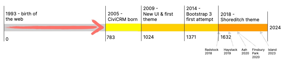
CiviCRM will be 20 years old next year. In Web Years that would make it, mapped against the 2024 years of Julian and Gregorian calendars, 1241 years old.
The idea of a theme for Civi began in 2009 (aka 1024 AD), with a new User Interface, which is largely CiviCRM's default interface we know today. It's called Greenwich after the part of New York City Tim Otten would walk thru each day during the Developer Camp (aka Sprint) where it was worked on. The following year work Kyle Jaster of Rayogram unveiled the first Civi theme, SimplyCivi, based on their work the New York State Senate.
First mention of Bootstrap came with Teja Amilinenis' Google Summer of Code project in 2014 (1371AD) which rewrote every CiviCRM Smarty Template (the markup that lays out each CiviCRM screen and form, before FormBuilder / SearchKit) in Bootstrap3. Like many theming and templating projects it ran out of support/money to go further. Then around 2016, with CivICRM 4.7.10, 'hook_civicrm_themes' was added to the API, allowing extensions to replace CiviCRM's default theme css.
At the start of 2017, Jon Screaton, a designer at Compucorp in London, created a new theme for the company’s CiviHR. This becomes, the following year of 2018 or 1632 (amidst the 30 year war, the 80 year, and the start of the construction of the Taj Mahal) Shoreditch, a CiviCRM theme for Drupal
Today there's a few public themes: Radstock is the default theme shipped with Christian 'Haystack' Wach's' CiviCRM Admin Utilities for WordPress, making CiviCRM integrate visually more with WordPress's UI. The Island ports Shoreditch to WordPress and keeps the Drupal versions up to date with new SearchKit and FormBuilder developments; Aah is Rich Lott's theme for Drupal and Standalone; Haystack ports Radstock to other CMSs, and Finsbury Park is my theme running on all CMSs.
With so many themes now, why do we need another?
In 1241 web years there have been many changes in what's considered the best way to write front-end (ie CSS, Javascript and HTML). For instance, the most common way of creating columned content has gone from tables (or even iFrames in early web pre-history), to floating divs, to using a framework like Bootstrap with more powerful, mobile-responsive column grids, to using native CSS column-count, Flexbox and Grid today.
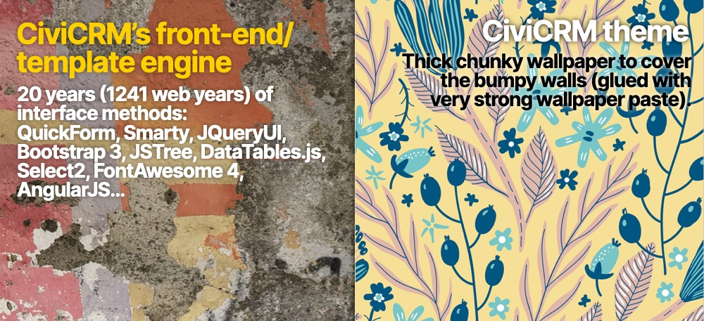
Because during those 1241 web years, CiviCRM –like WordPress– hasn't had a breaking upgrade that forced a full data migration from an old architecture to something new. This is unlike Joomla and Drupal which periodically end a development branch and require sites to migrate to a new, more modern architecture, sometimes frustrating users so much, they fork the software, such as the Drupal 7 to 8 migration that led to the creation of Backdrop. But as they're in constant use, CRMs cant easily have breaking upgrades; and so CiviCRM's interface has 20 years of web technologies holding it together: from Smarty and QuickForm, to JQueryUI and AngularJS, Select2 to JSTree, DataTables and SearchKit, to Bootstrap3 and Form Builder.
CiviCRM is this mish-mash of nearly 20 years of web technologies and methodologies, and a theme tries to paste an image of consistency on top. Civi themes do a lot of work to style multiple variations of buttons, accordions, dropdowns and tables consistently. They are expected to look the same, but are written in completely different ways. (The newish extension ThemeTest, which has been expanded during this project, was designed by Rich Lott to help with this).
It's a bit like taking the crumbling walls of an old building using a variety of different bricks, stones and surfaces, and pasting a super thick wallpaper over the top, held on with super-glue-like paste.
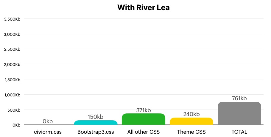
This thick wallpaper has increased the size of the CSS shipping with CiviCRM in some themes by over 500%:
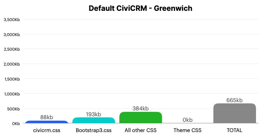
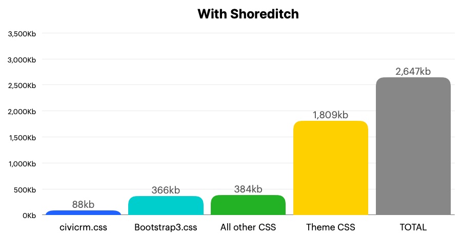
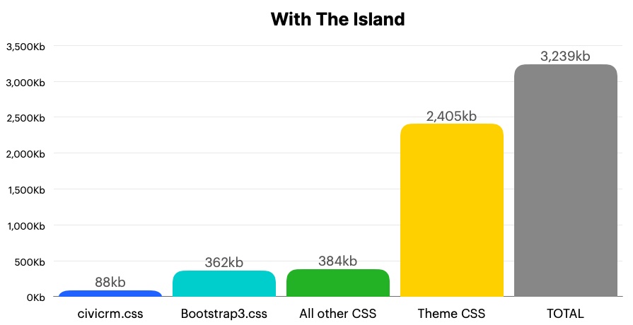
In the charts above you can see the CSS loading with CiviCRM growing from a default of 665kb, to 2.65mb in Shoreditch and 3.24mb in The Island. There's a few drawbacks to this beyond the obvious issue of site speed (especially those loading CiviCRM in regions with metered Internet access) – there's the carbon-footprint of loading more megabytes, and the complexity in maintaining and updating a large CSS codebase. Of course, for many office-based end-users this isn't an issue, but there's a bigger problem.
When someone tries to improve the markup in the underlying CiviCRM templates to make Civi more modern, consistent, accessible or mobile friendly, they could break a theme. I've discussed before the DINO approach Rich and I formulated to improve CiviCRM's markup. Following that blog, and some epic work from multiple people in the community, we converted over 100 inaccessible accordion interface elements by CiviCRM 5.72, into JS-free, modern-HTML, fully accessible accordions. But this work broke every theme. Thankfully most themes updated - but this is work themers aren't normally being paid to do, while the size and complexity of the themes makes it not always straightforward to make a fix.
So themes are difficult to build, and they either break as Civi modernises, or Civi is forced to stop improving its markup. Furthermore, like wallpaper, themes naturally will date as fashions come and go. If lots of effort was focused now on making a slick new theme using the 'thick wallpaper' model, in 5 or 10 years it will look dated to some people and require the same work all over again (or more because Civi's UI will be even more complex by then).
Furthermore different organizations have different expectations of how Civi should look and feel – some might want a simpler, more colourful and friendly interface. Some might want something that looks as dull but reliable as a spreadsheet; for others it might be something that is part of their Intranet and should ideally fit in seamlessly. The arrival of Standalone adds a new challenge, opening the door for CiviCRM, through the API and oEmbed, to integrate with software with completely different interfaces (looking at you SquareSpace, Wix, NextCloud and the Fediverse).
So does theming have to be difficult and prone to breaking? Thankfully, no!
Getting plastered with icebergs
For a long time the community's answer to the problems described above has been 'SearchKit and FormBuilder'. With these two tools, CiviCRM's entire template engine can be replaced with something consistently outputting the same classes - replacing the old crumbling walls of Civi's front-end with new ones. However, given the scale of this work – with many functions and screens still to be migrated – it's clear we're stuck with the old templates for a while yet.
In the meantime, maybe CiviCRM could get a fresh layer of plaster on top of those old walls, so that wallpaper can easily be hung on top, and replaced.
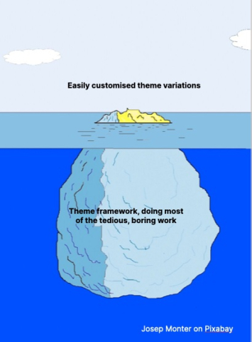
In other words we need (warning: metaphor jump) an Iceberg theme.
- The styling information sits above the surface, and is tiny, compared with the supporting CSS framework underneath, doing all the heavy lifting.
- CSS Variables provide the bridge between the two, allowing changes to supproting CSS not to impact styling CSS (and vice versa).
- Development and rewriting of key components like Form Builder, Search Kit or dashboards shouldn’t break the top layer, as they can keep using the same variables.
- Themers focus on the bit that sits above the surface. CiviCRM core code focus on what sits underneath and keep it stable.
This new architecture has three ambitious goals that it should be judged against:
- Making a simple new theme should be a few hours work, at most (of course like any design task you could also choose to spend months on it).
- Maintaining a theme should be a few hours work a year, at most.
- Improving CiviCRM's markup (to make it more accessible, responsive or modern) shouldn't break user's themes.
Introducing River Lea - a CiviCRM theme framework
River Lea, whose name comes from the tradition – started with Greenwich – of naming CiviCRM themes after where they were created is not so much a 'new theme' as a framework for CiviCRM themes.
It's both the under-the-surface iceberg of supporting CSS, and the above-the-surface style CSS subthemes that I'm currently calling 'streams' (as in branches of a river). Perhaps people would prefer to call them Wallpaper or Styles, or something else - but for now RiverLea comes with:
- Minetta, named after the creek that runs under Greenwich village New York.
- Walbrook, named after the river that runs under Shoreditch, London.
- As of last Friday there's a third Stream 'Hackney Brook', which runs under Finsbury Park.
Streams are currently around 450 lines long, which is about 15kb uncompressed and commented - and despite the small size, they should look very similar* to the Greenwich/Shoreditch/Finsbury Park themes you are used to.
How do they look different from the originals?
Most changes are either to do with accessibility, or consistency between SearchKit/FormBuilder output and the rest of CiviCRM. In all three Streams, sizes are mostly rewritten in Rems not pixels, with the base font-size being the widely recommended Browser default of 16px. The edit regions on the Contact dashboard now shows an edit icon, because of feedback in Hamburg that depending entirely on hover to reveal the edit button is inaccessible (and not good on touch devices either), and some contrast ratios have been improved.
Greenwich buttons lose their drop-shadow, as well as some opinionated bits of JQueryUI like specifying Verdana font every so often, or background gradient textures. It also gains Shoreditch's nicer date-picker UI.
A few other changes occur either to make things look a bit neater, or because it's the easiest way to write one base theme across multiple variations (aligning Shoreditch accordions which often run edge-to-edge, for e.g. was a challenge).
River Lea : Minetta 
Default CiviCRM (aka Greenwich) 
River Lea : Walbrook 
The Island (aka Shoreditch) 
River Lea : Hackney 
Finsbury Park


And the total CSS size?
The base theme's CSS with the three stream's CSS currently totals around 240kb. This will likely grow during testing (and shrink a little as Bootstrap is reduced, and core CSS overwritten) but at present gives a total size a quarter that of The Island/Shoreditch, and a bit larger than Greenwich (but with three alternative UIs).
Icebergs? Wallpaper? Rivers! How exactly does this work?
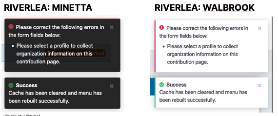
Let's take one example that illustrates the new approach: Notifications. In Greenwich (default Civi) and Shoreditch/TheIsland they look like this:
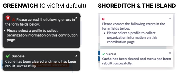
You might spot a few issues: the double icon in Greenwich, the word 'success' is smaller than the text underneath it in both themes (because it's an H1 tag), the close icon is a letter 'x' rather than an actual close icon, the Greenwich icons are using image sprites which Civi has been trying to phase out.
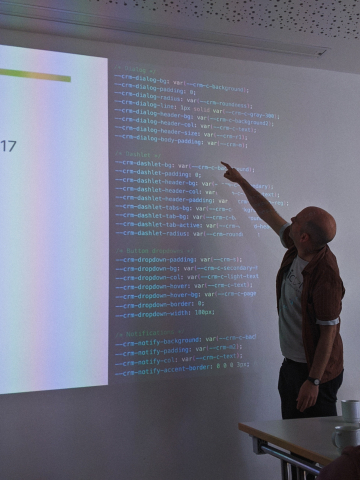
In River Lea, there's a components directory with a file _dialogs.css that over about 60 lines produces the CSS to handle Notifications. Some of this, like the max-height of 600px is set for all streams here. Other bits are handed over to CSS Variables which you can see in the following snippet:
#crm-notification-container div.ui-notify-message-style {
	background: var(--crm-notify-background);
	box-shadow: var(--crm-popup-shadow);
	color: var(--crm-notify-col);
	border-radius: var(--crm-notify-radius);
	padding: var(--crm-notify-padding);
	margin-bottom: var(--crm-r);
	max-height: 600px;
	overflow: auto;
	border-width: var(--crm-notify-accent-border);
	border-style: solid;
	border-color: transparent;
}
#crm-notification-container div.ui-notify-message-style a {
	color: var(--crm-notify-col);
	text-decoration: underline;
}
#crm-notification-container div.ui-notify-message-style.error {
	border-color: var(--crm-c-alert);
}
A variable '--crm-notify-background' defines the colour for the background. '--crm-popup-shadow' describes the dropshadow for this and all dialogs and popups. The margin-bottom: '--crm-r' is a size unit '--crm-c-alert' is a practical colour (which in turn points in all three streams to a '--crm-c-red') .
Each Stream is really just a file called _variables.css which lists the settings for each of these variables, and only five are specific to notifications: variables describing the background colour, the text colour, the padding, the level of rounded corners and if there should be a coloured border on any side depending if the notification is a warning, info notice or success alert. You can see the outcome, and the five CSS variables that defines this difference below:
/* Notifications */
--crm-notify-background: rgba(0,0,0,0.8);
--crm-notify-padding: var(--crm-m2);
--crm-notify-col: var(--crm-c-light-text);
--crm-notify-accent-border: 2px 0 0 0;
--crm-notify-radius: var(--crm-roundness);
/* Notifications */
--crm-notify-background: var(--crm-c-background);
--crm-notify-padding: var(--crm-m2);
--crm-notify-col: var(--crm-c-text);
--crm-notify-accent-border: 0 0 0 3px;
--crm-notify-radius: var(--crm-roundness);One more thing… dark mode
The simplicity CSS Variables brings has made it relatively straightforward to create a dark-mode version for each theme. They have had limited testing are available on each Stream. E.g. on Walbrook/Shoreditch:
So, what next?
- If you're on CiviCRM 5.80 or greater, go to your CiviCR extensions manager, find RiverLea and click install & enable.
- Go to Administer > Customise Data and Screens > Display Settings, and select it on for Backend Theme. Turning it on for Frontend is possible, but is not recommended unless you can have the time to test every front-end page – or are on a dev site.
- There will be four themes to choose from - as since writing this blog Rich Lott, aka Artful Robot, has ported Aah theme into Thames. If you are used to not having a theme, Minetta will be the closest to what you are used to, if you're used to Shoreditch or the Island, then choose Walbrook.
- If you encounter any problems, please either open an issue on the extension gitlab; or post in the ~UserInterface channel.
(these instructions were updated in December 2024 after the release of CiviCRM 5.80)
Comments
Great write-up and excellent to see this moving forward well.
Great post @nicol. Thanks