Hi I am Aditya Nambiar , a 3rd year undergraduate student pursuing Computer Science and Engineering at IIT Bombay. I am currently working on a GSOC project - Visualization for Mailing stats and A/B testing with Kurund Jalmi as my mentor
This project aims at creating an A/B testing tool for CiviMail so all users of CiviMail can improve their response rate for all their mailings. To make this easier on the end user, this project will also incorporate graphical reporting (such as using charts, graphs etc.) of the mailing statistics. This will allow the admin to interpret and monitor the results of their mailing campaign and hence make a decision based on data.
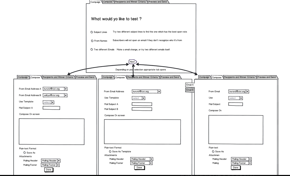
We (my mentor Kurund Jalmi and I) are currently finalizing how the UI of A/B Testing should look like. To come up with a good UI I have searched through other available A/B testing platforms and my findings are available here http://wiki.civicrm.org/confluence/display/CRM/Research+Work
Several Components were more or less common to all of them such as
- The Test Type :-Subject Line, From Address and Email Content.
- Winner Criteria :- Open Rate and Total Unique Clicks.
One that was missing was the the total unique clicks on a particular link which I believe is required and was implemented by only one websites.
- Slider Bar (Or something similar ) to decide the percentage of subscribers to be tested upon.
- How long the test should run for
A few of the websites gave the option of automated testing but none of them appeared to have used statistics i.e gave the confidence interval of how better version A is than version B. I have planned to use Hypothesis testing in the A/B testing in CiviMail so that the results that which version is better are statistically significant .
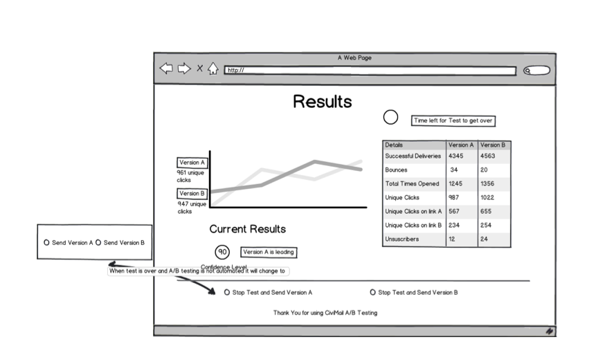
Apart from that there would also be a graphical view of the results of version A and version B as it was implemented by a few of the websites. There would also be a preview page, to preview the email created and send test email and also to review all the selected options so that the user could verify them.
The link to the UI mockup is http://wiki.civicrm.org/confluence/display/CRM/UI+Mockup. Below are the first and last tabs in the mockup


Please suggest ideas/changes in the current mockup . Thanks


Comments
I wonder if that decision point at the beginning is necessary and if it would create more work as you have separate cases to render and process.
An alternative might be to go straight into the composition tab and then have a checkbox next to each piece saying, "Test this". Normally, you'd just see "From address", while if you check the box, that field's label would become "From address A" and there would appear a new field, "From address B". The same goes for one or two subjects, messages, headers, and footers.
I think it might be more intuitive for folks trying it out (they may not know what they want to test until they get in there and start writing), and it cuts out one step. Also, it could be integrated into the regular CiviMail interface pretty smoothly: there wouldn't need to be a distinction between a regular CiviMail message and an A/B test: if you don't test anything, it's not an A/B test, and the testing-related stuff doesn't appear.
+1 to Andrew's UI suggestion - one of the goals of the GSoC student doing CiviMail redesign is to remove tabs!
It seems like it would be hard to merge this work with the other GSoC student's work if there wasn't very early collaboration!
<p>It would be helpfui to use unsubscribes as a factor for deciding winners. We don't use the email tracking feature, but are still interested in using A/B testing.</p>
A/B testing is a very important feature - and having it integrated will give CiviCRM a significant competitive advantage. This is what many of us are looking for - and here I am speaking as an implementor AND as a user!
Your mockup looks pretty well - but as I am looking over it, I see a few issues I wnat to point out:
1) Automation:
This does not really make sense to me! I am searching for a tool to perform A/B-testing - but in real life I will make the decisions about my mailings not fully automated, but based on test results combined with "gut feeling". My recommendation: Skip the "automation" thingies and save the work for this "nice to have" feature.
2) Integration within mass mailing UI:
I fully agree with Andrew's idea to simplify the first step. You should collaborate closely with the current gsoc project regarding the mail interface - it would be great if the general blast mail UI would be combined with the A/B testing stuff.
3) Privacy issues (for me, the most important point I want to mention):
We (as many many other privacy related organisations!) do not use the "mail tracking feature" and are not willing to do this in the feature - in my opinion, it feels creepy if an email sender can see, which mail I have opened and which links I followed.
For most use cases, it is not even necessary to do the tracking on a personalized base - but it would be helpful to have tracking on a summary level: Within tracking, there should be an option to use this on a "per recipient base", with unique tracking codes for each recipient (which currently is the only option available). BUT ALSO, there should be an option which does tracking on a "cumulated level", with only two tracking codes (one for each testing option A and B). These tracking links might even be visible to the mail recipient.
Though I am aware, that this will increase your gsoc project's scope: Having this feature implemented, would create a very big benefit for many users!
Cheers,
Detlev
Detlev - I'm not quite understanding your suggestion regarding privacy and tracking. It seems like we do need to track opens and clicks in some manner order to evaluate the 'success' of each of the tests. Are you suggesting we have a setting where we do that tracking but ONLY show the totals and don't expose the details in the UI (e.g. remove the drilldowns that show which recipient opened, which recipient clicked this link)?? OR are you suggesting that when we record the opens and click-throughs we simply increment a counter value in the DB rather than recording an event against the recipient ?? Or ????
For what I understand, the issue is more with the core feature of civimail than with A/B testing
Detlev, it's probably rather simple to write a "anonymising" extension that removes the contact id before recording the click (or assign them all to the same "anonymous" contact)
I haven't looked, but I am assuming a standard BAO for the click/open so you could use the pre hook to alter the contact id. Keep in mind you would obviously loose the option to distinguish between two clicks from the same contact vs. two contacts clicking.
This should allow to keep the A/B testing working while improving privacy.