If you've been following the CiviCRM blog, you probably noticed the reports from Google Summer of Code 2014: Siddhant Rajagopalan built a new CiviMail composition screen, and Aditya Nambiar built an A/B testing system. In late 2014, the core team extended this work (revising architecture, adding missing features, and fixing bugs), and 4.6.alpha1 is the first downloadable release to include the refreshed CiviMail. I want to give a quick tour of some of the UI's and changes.
Layouts
CiviMail is a powerful tool with a lot of options. Of course, options come at a cost -- they increase complexity and make an application harder to use. In designing the revised CiviMail UI, we want a balance which provides options for power-users while also providing a gentle experience for casual users.
I discussed that balancing act with several members of the community, and two different approaches arose repeatedly:
- In the wizard approach, the user takes a tour through the list of options as she prepares the mailing. The options are broken down into a sequence of screens so that each screen appears smaller and more manageable.
- In the unified approach, the CiviMail experience revolves around one screen that resembles a standard email screen -- it contains the most important details (such as the recipients, subject and body of the mailing). Any other options are "advanced" -- the user shouldn't have to deal with them unless they want to.
The preferences for a wizard or a unified approach are sometimes rather strong, and I believe that they're loosely linked to organizational factors. A large organization with a full-time communications staff might use CiviMail to send a newsletter to 100k constituents; such a newsletter merits considerable editing, review, and testing, and a wizard encourages a commensurate thoughtfulness. By contrast, a small organization with casual volunteers might use CiviMail to keep in touch with groups as small as 20; unnecessary steps or complexity can be frustrating, so a simpler experience (maybe a step or two above the level of Gmail) is ideal.
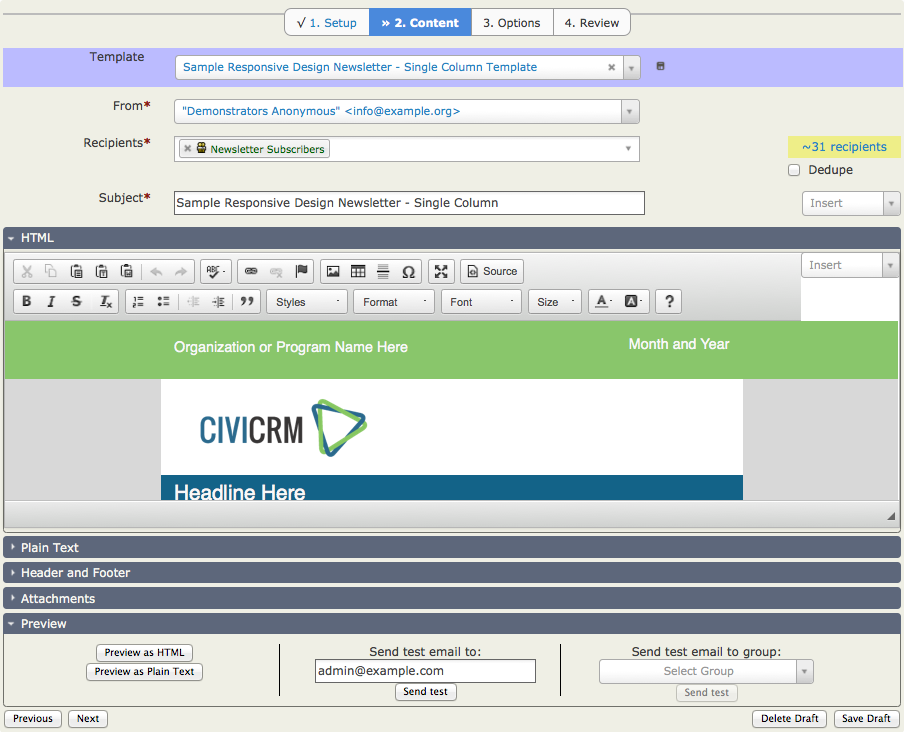
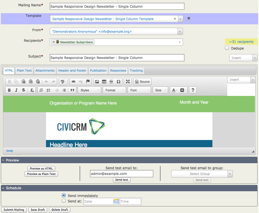
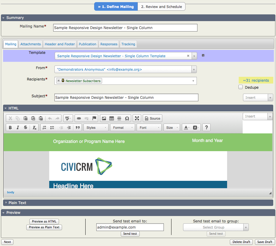
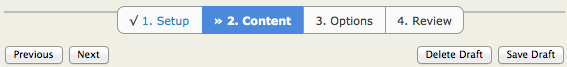
With Civi 4.6.alpha1, we've decided to experiment a bit. CiviMail includes three functionally equivalent layouts -- they present the same options with different ways. (Note: To access the demos, you should first login to dmaster.demo.civicrm.org. Note that the demo site is refreshed daily, so it may continue to evolve, but the screenshot and source links are fixed at time of publishing.)
| Layout | Screenshot | Demo | Source |
|---|---|---|---|
| Wizard (4-step) | CiviMail-4step.png | civicrm/a/#/mailing/new/wizard | partials/crmMailing/edit-wizard.html |
| Unified (1-step) | CiviMail-unified.png | civicrm/a/#/mailing/new/unified | partials/crmMailing/edit-unified.html |
| Compromise (2-step) | CiviMail-2step.png | civicrm/a/#/mailing/new | partials/crmMailing/edit.html |
It would be great to get some reactions to these. Which layouts seem acceptable or unacceptable? Why? Would you design something different? Can we standardize on one layout, or do we need to maintain multiple? What should be the default? Why?
Recipients
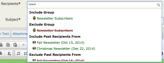
Regardless of one's layout preference, there are several things which have been improved (for use with any layout). For example, when the CiviMail GSOC projects began, the first screen of CiviMail's "New Mailing" wizard prompted for a list of recipients using this beast:
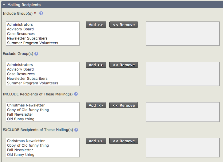
That UI is very powerful -- but it displays sixteen(!) widgets (8x <SELECT> and 8x <BUTTON>). By contrast, most familiar email UIs prompt for recipients using one text field. In v4.6, the "Recipients" box starts out as one text field; but, as you use it, it grows richer. In this example, the user starts to type "newsletter", and the dropdown suggests a number of possibilities.
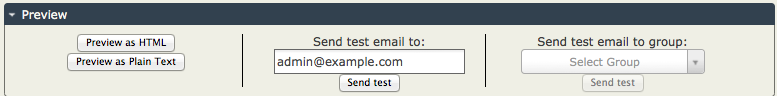
Convenient Preview
Previews are now more convenient -- they no longer require navigating to a separate screen. For example, when selecting recipients, CiviMail estimates the number of recipients immediately. When composing the message body, one can quickly, iteratively send tests and tweak text -- without navigating back-and-forth among screens.
Lightweight Wizard
Wizards in the new CiviMail screens use a lightweight, Angular-based implementation. In the old interface, the only way to navigate among steps was with "Previous" and "Next" buttons; each click of the buttons required a full page-refresh.
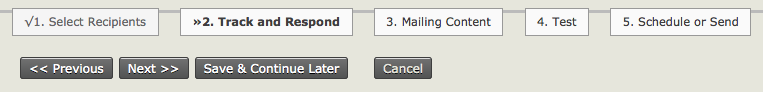
CiviMail's lightweight wizard navigates between steps quickly (without a round-trip), and it allows skipping back directly to any previous step.
(Note: This screenshot also shows the greatly improved wizard styling independently contributed by William Theaker.)
Architecture
When I was a system-implementer working with Civi 2.x, I was eager to rework the CiviMail experience. This was challenging -- if you wanted to do something as simple as moving a field from one screen to another, you had to override four lengthy files (two PHP files and two Smarty files). v4.6 doesn't go so far as to encourage system-implementers to customize CiviMail, but it does make many changes easier. How? The major UI elements are designed as components which can be remixed/reorganized in different ways -- thus, we can use the same elements in a wizard-based mailer, in a unified mailer, and in an A/B mailer. (More on A/B testing a future blog.)
Limitations
- v4.6 focuses on improving the user-interface -- but doesn't change the content-model. In particular, it still uses the same concepts for "mailings", "headers", "footers", "automated messages", and "message templates". It would be great to explore other content models -- but we couldn't fit that into the v4.6 development cycle.
-
There are a few things that aren't in 4.6.alpha1 but are slated for working during the alpha/beta cycle. Feedback on these or other issues would be great in helping us prioritize improvements Specifically:
- The styling (spacing, sizing, etc) needs work.
- Help buttons need to be added.
- Field validation needs tuning (esp. in wizard-based interfaces).
- Draft mailings should be automatically saved (eg every 2min; or after 20sec of inactivity).
Try it out
To try out the new CiviMail UI, you can login to the public sandbox for v4.6.x, download CiviCRM v4.6.alpha1, or download a bleeding-edge nightly build.
Comments
The wizard!!! http://youtu.be/LpCrj9Ysyjo
Great work. I am not sure if you want reactions here - I have a lots of opinions.
If these were the final designs then overall I think the unified layout works best.
I could be persuaded that there are advantages to having the review section in the compromise layout. However I don't like the way the mailing name is separated out on its own and has no red box arround it. That was the first layout I tried and I actually missed giving my mailing a name and then was wondering why I couldn't preview it. I think having plain text as one of the tabs works better than having it as an accordian.
I don't like the wizard layout. A whole screen just for mailing name seems rather extravagant. I also prefer the tabs across the top for options rather than the accordions in the body of the screen. I think the accordions would make it easier to forget to set something whereas the tabs would be harder to overlook.
I think the best option could be the layout of the unified screen as far as the end of the Preview accordion and then the Review and Schedule screen of the compromise layout.
This is partly because, although I agree that the default for Publication (don't like that name, should it be Visibility?) should be Public, it is a change from the current situation. The review screen should act as a prompt and help prevent mailings going out set to Public when they should have been set to User and User Admin.
Finally, I actually think there would be value in being able to set (overridable) system defaults for Publication, Repsonses and Tracking on the CiviMail Component Settings Screen. I know you can set defaults on a message template, but I like the idea of being able to set it for all CiviMailings. The review screen would be very necessary then, as you couldn't expect people to remember what the dafaults for the system were.
Thanks, Joanne. A few random replies:
Re: Publication. Sorry for the red herring. We are on 4.4 and it has default as User and User Admin Only (as did 4.2). I hadn't absorbed the fact the 4.5 had the deafult as Public Pages.
I now realiase there are no message template defaults for tracking etc as message templates aren't only for emails. I mud have been confusing it with re-using a previous mailing. For me that makes configurable defualts on the CivMail Component Settings page essential with any of the new layouts.
The improved recipients control is a great improvement. Not sure how useful the preview feature is given that emails look radically different in different email clients.
Have you addressed how the UI will work for search-based mailings? (A search-based mailing is when you start a mailing by searching for contacts, selecting the results and then selecting the action "Schedule/Send a Mass Mailing".) For search-based mailings, an Unsubscription Group must be specified, and the recipients from the search should be included.
In version 4.5 CiviMail there is a serious bug where if you save a search-based mailing and then return to continue it later, the UI treats it as a non-search-based mailing and forgets the Unsubscription Group, which means that recipients are unable to unsubscribe (see CRM-15624 and CRM-14079). It would be great if that bug could be fixed as part of these UI changes.
After a quick run through I would modify the wizard down to 3 steps
Step 1 - combine Steps 1 and 2 of the wizard
Step 2 - what you currently are suggesting as Step 3
Step 3 - what you currently are suggesting as Step 4
Rationale:
Can't see the value in having a single step for the Mailing Name (in Setup)
Having the 'options' on a separate step as Accordian is better than tabs imo as it makes sure users remember these options exist
Combining steps 1+2 makes sense to me. It mitigates (IMHO) one of the major flaws of the wizard -- by putting the content in the first step, it displays the most important options more quickly.
OTOH, I'm generally biased against wizards. It would be great to hear from someone who's more keen on wizards generally.
It is interesting how people perceive things differently. I am much more likely to overlook an accordian than a tab.
I think making it a thee step process would only help users remember those options exist if the Schedule frame was transferred to step 3.
If step 2 only consisted of tracking, responses and pulication ( or visibility?) then I think people are likely to look at them.
With the current step 3 what jumps out at me is Schedule and once I had done that I would be likely to move on to the next page.
Tim and I would like feedback on two additional design decisions …
1. Rethinking the ‘Reuse’ sent mailing UI
Currently users click the ‘Reuse’ action link on the list of mailings if they want to copy / reuse a mailing (content, recipients and a few other properties are copied). We think it may be more intuitive to extend the existing ‘Template’ select to expose BOTH message templates and prior mailings in two groupings. The presentation would be similar to that used in the new Recipients selector (where the user sees “Include Group”, “Exclude Group”, “Include Past Recipients From” etc.).
With this design, the user can set content from a message template OR content ++ from a prior mailing - both from the same place in the interface.
2. Finding a place for ‘Dedupe’ checkbox and the new ‘Select location type for mailing’ option
Both of these are related to the selection of ‘Recipients’ - but for many (most?) users the existing defaults will be fine. Hence we’d like to move both to less prominent positions in the UI. Two possibilities:
* Add a ‘Gear’ (configure) icon to the right of the Recipients select field. Clicking the Gear produces a pop-up containing both of these ‘recipient filtering options’.
OR
* Add a new tab / pane for these two fields. Tab or pane title could be ‘Addressing’ or ‘Address Filters’ or ???
Re No 1.
I am all for it, that would be a great improvement IMO.
An even better improvement may be to have the ability to create an "email template" that included all the options (recipients, dedupe, location type, message template, header, footer, tracking, responding, publication) for that particular email type (i.e. the newsletter, the call for volunteers, the appeal reminder etc.). I realise that is effectively what you have if you choose to re-use an existing mailing, but it will always have a specifc name such as "September News for Professionals" rather than the generic "Newsletter template for professionals"
Re No 2:
Harking back to my earlier post, these are two more setting that I believe should be able to be configured for the site in CiviMail Component Settings then overridden at the individual email level if required. If they are moved to a less prominent position then I also think they need to be part of the review which I would like to appear just above the scheduling pane which in turn should be just above the Send Mail button. A nice, but perhaps not-worth-the-effort touch would be to have each field name in the LHS in the review as a link back to the screen/pane where that setting can be changed.
Gear or Tab/Pane?
I don't like the idea of a tab/pane, as the settings are really part of defining the recipients so a separate screen/pane just seems wrong to me.
However, I think a gear may be a bit obscure for some users. A button with FILTER or REFINE on it for the pop-up would be better IMO, but that takes up more space.
If there is a review pane that inludes dedupe & location type with the names being links back to the pop-up window, as suggested above, then I think a gear would be OK.
re: 1 --
I prefer the existing terminology and usage. Most of my users think of a mailing as a very distinct, packaged set of content/options. When they reuse it, they're expecting that entire package to be replicated, and then available for adjustment. While this has some correlation to how templates are used in CiviEvent, the term template in CiviMail has a much more narrower application -- the mailing content layout. And I think in this context, it's best to limit the concept in that way -- it's the general usage of the term in other mailing applications as well. So to include an option to load a previous mailings config and content from within the mailing risks conflating the two ideas (reuse and template), and creating confusion. I think the current behavior is more natural for people to understand the functionality.
I think jchester's comment is a different functionality, but something that could be useful. However, for the same reasons stated above, I would avoid calling it an email template. Perhaps a "saved email" or other term.
re: 2 --
I'm not crazy about putting these options in a gear menu. I think they are important and deserve some visibility. But if we do put them in a gear menu, we should also give the system admin an easy way to set the default values. The dedupe option, in particular, is almost always enabled by my users, but is default off in Civi. If it's hidden in a gear menu, users will be less likely to see and set it. I definitely don't think the options should be in a separate tab.
Thanks for the feedback.
re: 2 - The Dedupe checkbox is ON by default in 4.5 and will be in 4.6 (there's a bug in the new Angular code at the moment which causes it to appear to be OFF). In general we think this is the behavior that a large majority of users would want and expect so we're looking for ways to simplify the user experience by making edge cases less prominent with intelligent defaults.
It would be great if the create mailing interface allowed the person creating the mailing to select the option
"Send to Contacts who are in all of the selected groups" instead of "Send to contacts who are in any of the selected groups".
A lot of organizations use a few general groups to denote general participation in mailings.
For example one big general group like "I agree to receive mailings from this organization (x)"
Or a couple of groups to select mailings:
"I want to receive mailings in: (x) English, (x) French" or "I want to receive communications about: (x) Local Issues, (x) National issues"
Then maybe they have 100's of committees/interest groups that are also groups. They would like to easily send an email to one particular committee in their preferred language(s).
Sure, they can create a smart group using the Include/Exclude search. (Doing this twice for both English and French in the second example.)
I would like to see this option "Send to Contacts who are in all of the selected groups" in create mailing so that every time the user creates a new interest group or committee they don't have to create the extra Smart groups.
Is there already another way to set this up easily that I might have missed?